
Your cart is currently empty!
Non-English Glyphs
Part 2 of 3
Last week I covered Æ, æ, Œ, œ, and ß. This week I drew Ð, ð, Þ, and þ. But first, a little detour back to eszett.
ẞ
Apparently, I was behind in my reading. I knew that designers had created their own solutions for a cap eszett, but I didn’t realize a standard had been adopted. In fact, the form was added to Unicode in 2008. It was codified in German orthography this past June (2017).
My earlier solution for the cap eszett was a slighly larger lowercase ß. So I went back and redrew it to conform to the standard ẞ.
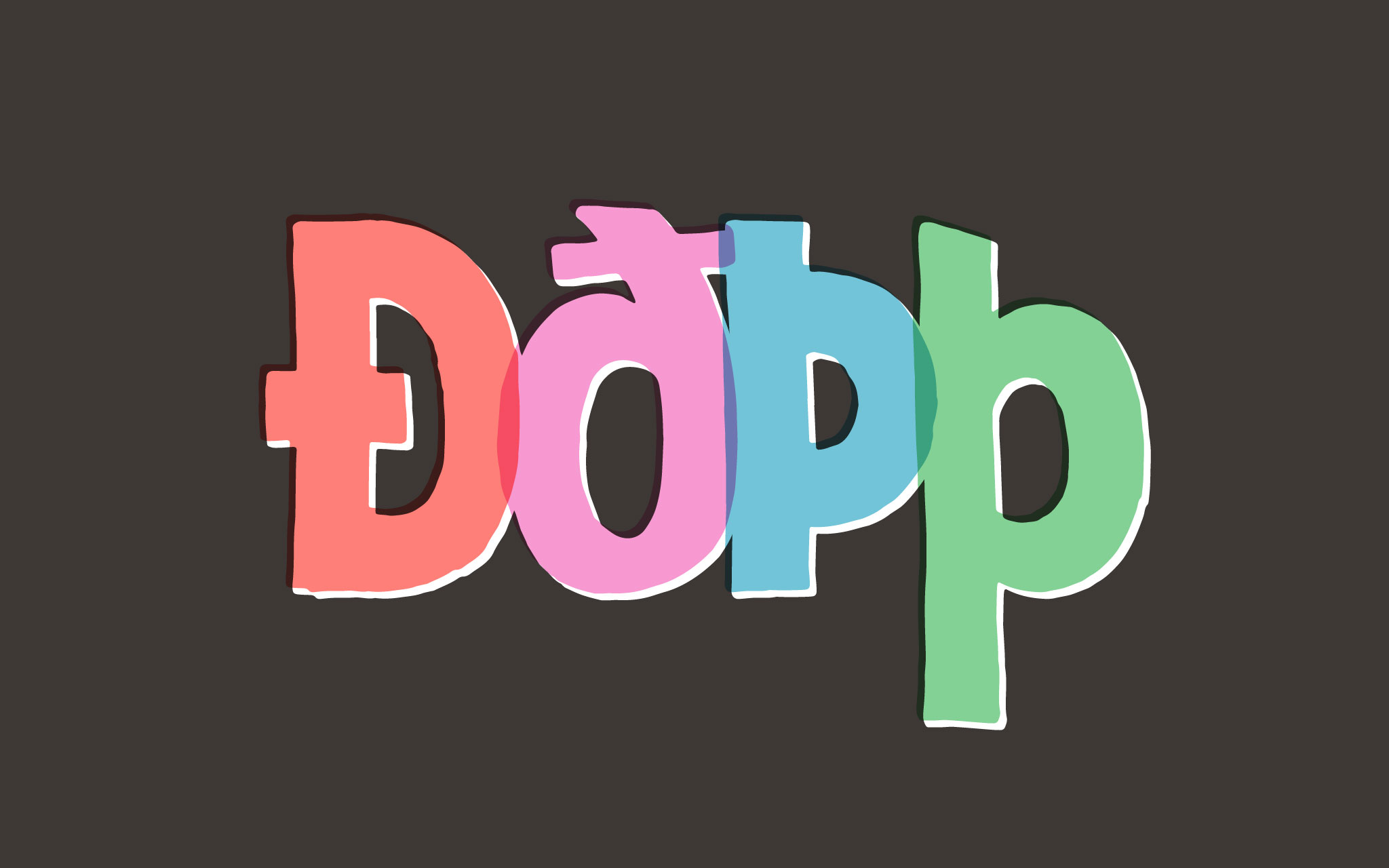
Thorny Problems
Icelandic uses a few glyphs for th sounds based on the old English runic alphabet. Thorn (Þ, þ) is for the unvoiced th sound (as in think).
Seeing as how Icelandic is not my native tongue (and not my tongue at all, actually—I don’t speak a lick of it), I need to consult the experts on how to draw their characters. Thankfully, Iceland has some super-skilled type designers. Sigurður Ármannsson and Gunnlaugur S.E. Briem both have fabulous articles on the subject.
As they both point out, the shape of thorn is based on P (or p). The uppercase Þ is basically the uppercase P with the bowl dropped down to midheight. It should be at the vertical midpoint optically. The top of Þ should be the same as I.
[fusion_imageframe image_id=”2126″ style_type=”none” stylecolor=”” hover_type=”none” bordersize=”” bordercolor=”” borderradius=”” align=”none” lightbox=”no” gallery_id=”” lightbox_image=”” alt=”” link=”” linktarget=”_self” hide_on_mobile=”small-visibility,medium-visibility,large-visibility” class=”” id=”” animation_type=”” animation_direction=”left” animation_speed=”0.3″ animation_offset=””]http://staging.quakercreative.com//wp-content/uploads/2017/10/Thorn-1024×640.jpg[/fusion_imageframe]
The lowercase þ is like a p with an ascender. This is different than a b with a descender.
My one issue is that I noticed my P has a substantially smaller counter than my p, due to the condensed shape. It makes me wonder if I’ll need to re-do some letters? I’ll see when I put things together.
The Lord Giv-eth
The last two glyphs are the eth characters (Ð, ð), which makes the voiced th sound (as in gather).
The uppercase Ð is the same width as a D, but with a cross stroke on the stem. The cross stroke should be the same width as the crossbar of H, and at the same height. It should stick out less on the left and more on the right. It needs not to take up too much of the interior space, and should not go past the middle of the counter.
[fusion_imageframe image_id=”2125″ style_type=”none” stylecolor=”” hover_type=”none” bordersize=”” bordercolor=”” borderradius=”” align=”none” lightbox=”no” gallery_id=”” lightbox_image=”” alt=”” link=”” linktarget=”_self” hide_on_mobile=”small-visibility,medium-visibility,large-visibility” class=”” id=”” animation_type=”” animation_direction=”left” animation_speed=”0.3″ animation_offset=””]http://staging.quakercreative.com//wp-content/uploads/2017/10/Eth-1024×640.jpg[/fusion_imageframe]
The lowercase ð is like an o with a bit of curved stem on top. Briem recommends starting with a parenthesis to inform the ascending stroke. Since the Protest typeface is informed by the tool, it was easier to just draw it, rather than piece it together from other bits. I had to be careful to put an ink trap in the joint between the ascender and bowl.
The cross stroke for the ð is angled down to the left slightly. It should have equal space visually around each quadrant it makes with the ascending stroke. The thing to watch for of course is the space below the cross stroke on the inside.
A Reminder
I need to remind myself of two thigns when drawing unfamiliar glyphs:
- It’s crucial to look at examples of the glyphs done by natives to the language.
- It’s helpful to learn how the glyphs are hand written so I can make them that way myself, and understand the underlying structure.
Up Next
Part 3: Ŋ, ŋ, Ɲ, ɲ, IJ, ij
Leave a Reply