
Your cart is currently empty!
Punctuation Part 1: Footnotes and Little Heads
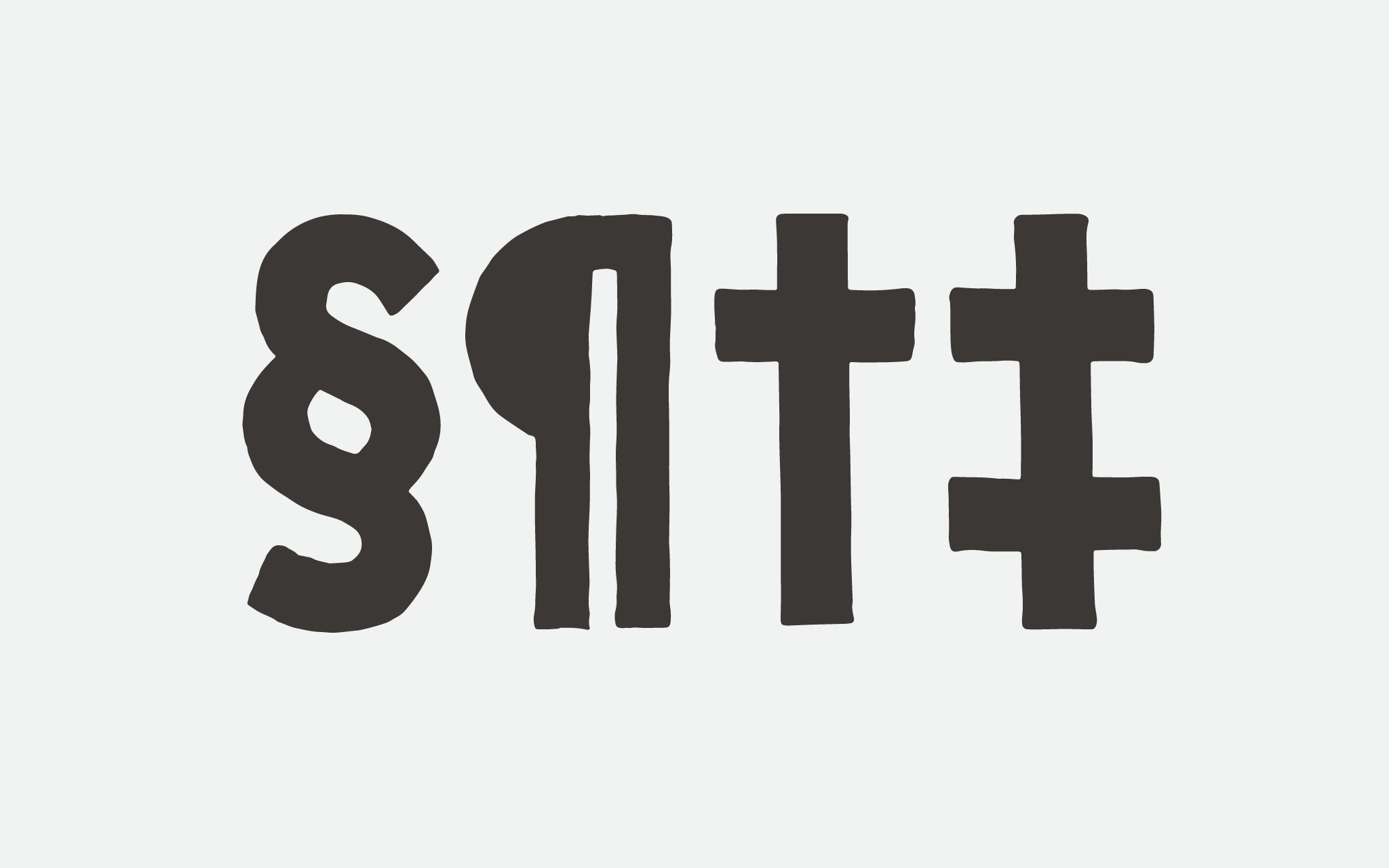
In my last post I finished up a series on letterlike symbols. This series will include 5 posts on punctuation, starting with 4 tall symbols used to organize information: † ‡ § ¶
Even thought it’s thematically related, I’m not using this post to cover the asterisk (*). That will be in Part 2 because of its size.
Dagger † and Double Dagger ‡
The dagger (also called an obelisk) and double dagger (aslo called a diesis) are used for marking footnotes on a page when an asterisk (*) has already been used.
The dagger (†) is a vertical bar with a cross stroke near the top. The double dagger (‡) has another cross stroke near the bottom. In serif text typefaces the daggers can be a lot more detailed. (The dagger in Times New Roman looks like this †.) The Protest font I’m designing is a sans serif, marker-based typeface, so I keep the form simple.
Daggers align with the cap height and drop below the baseline, but not as low as the descender. The cross strokes are longer than the cross stroke of the lowercase t, but shorter than the arms of the uppercase T (sometimes only just). I’ve chosen to make mine the same length as the uppercase T, since the T is so compressed, and the proportions work well that way.
[fusion_imageframe image_id=”2184″ style_type=”none” stylecolor=”” hover_type=”none” bordersize=”” bordercolor=”” borderradius=”” align=”none” lightbox=”no” gallery_id=”” lightbox_image=”” alt=”” link=”” linktarget=”_self” hide_on_mobile=”small-visibility,medium-visibility,large-visibility” class=”” id=”” animation_type=”” animation_direction=”left” animation_speed=”0.3″ animation_offset=””]http://staging.quakercreative.com//wp-content/uploads/2017/12/symbols-pt1-daggers-02-1024×640.jpg[/fusion_imageframe]
The location of the cross strokes on the stem and how far below the baseline the stem dips vary from typeface to typeface. I’ve aligned the upper cross stroke with the cross stroke on the t, which aligns with and hangs under the x-height. The lower cross stroke sits on the baseline.
I’ve chosen to have the stem drop below the baseline the same distance as the cap height is above the x-height. So the distance from the x-height to the cap height is the same as the distance from the baseline to the bottom of the dagger glyph.
Section §
The section symbol (§) is used to delineate sections of a document (unsurprisingly, given the name). It can also be used for a fourth footnote, the *, †, and ‡ having been used.
The section symbol is made of two conjoined uppercase S’s, one above the other. The S forms making up this glyph are slightly smaller than a cap S in order to fit reasonably within a slug of metal type, or the digital bounding box. The § should also be slightly narrower than the S, due to the width of the smaller S components.
[fusion_imageframe image_id=”2186″ style_type=”none” stylecolor=”” hover_type=”none” bordersize=”” bordercolor=”” borderradius=”” align=”none” lightbox=”no” gallery_id=”” lightbox_image=”” alt=”” link=”” linktarget=”_self” hide_on_mobile=”small-visibility,medium-visibility,large-visibility” class=”” id=”” animation_type=”” animation_direction=”left” animation_speed=”0.3″ animation_offset=””]http://staging.quakercreative.com//wp-content/uploads/2017/12/symbols-pt1-section-02-1024×640.jpg[/fusion_imageframe]
The glyph aligns with the cap height and drops below the baseline, but not as low as a descender. It aligns with the bottom of the daggers.
Counters within this glyph should be relatively equal, with the lowest counter being larger than the upper, just as in the S. The counter in the middle can be slightly smaller.
Pilcrow ¶
The pilcrow (also called a paragraph sign, but that’s not as fun to say as “pilcrow”) is used to denote paragraphs, usually in a legal or academic setting, like the section symbol.
The pilcrow is designed based on the uppercase P. However, it is actually derived from an uppercase C (for the Latin capitulum, meaning “little head” for a minor heading or start of new topic), which is why it faces the direction it does.
The bowl of the ¶ is solid, and often aligns with the bowl of the P, although it can also be smaller, with the lower end sitting higher than the lower end of the bowl of the P. It also does not stick out as far as the bowl of the P.
The two vertical strokes making up the stem are thinner than an uppercase downstroke. The distance between them is about the same width or slightly smaller than the width of an uppercase downstroke. I’ve made this space smaller to match the color of the typeface (which is important), and because the pilcrow is typically not wider than the P, which this is. It’s a balance.
[fusion_imageframe image_id=”2185″ style_type=”none” stylecolor=”” hover_type=”none” bordersize=”” bordercolor=”” borderradius=”” align=”none” lightbox=”no” gallery_id=”” lightbox_image=”” alt=”” link=”” linktarget=”_self” hide_on_mobile=”small-visibility,medium-visibility,large-visibility” class=”” id=”” animation_type=”” animation_direction=”left” animation_speed=”0.3″ animation_offset=””]http://staging.quakercreative.com//wp-content/uploads/2017/12/symbols-pt1-pilcrow-02-1024×640.jpg[/fusion_imageframe]
This glyph aligns with the cap height, and drops below the baseline, aligning with the daggers and section symbol.
Up Next
- Punctuation
§ ¶ † ‡- * # – – — _
- . , ; : ! ¡ ? ¿ ‽ … •
- ' ‘ ’ ‚ “ ” „ ′ ″ ‹ › « »
- / \ | ¦ ( ) [ ] { }
- Mathematic Symbols
- %
- + − ± × ÷ = ≠ ≈
- > < ≤ ≥ % ° ⁄
- Diacritics
Tags:
Leave a Reply