
Your cart is currently empty!
Punctuation Part 2:
Dash It All
Last week’s post began a 5 post series on punctuation, starting with 4 tall symbols used to organize information: † ‡ § ¶. Today’s post will be continuing the punctuations series with # ‐ – — _ and *. These punctuation marks all contain horizontal lines, save for the asterisk.
1000 Yard Em Dash —
First, a bit of history.
When casting the earliest metal type, the M was the widest glyph, and visually close to square. The face of the metal slug on which a glyph sat would have a height tall enough to accommodate caps, ascenders, and descenders. A square with width equal to this height is called the em square. Today, the em square is a square whose sides equal the font’s UPM, or “Units Per eM”—which is to say, the size of the immaginary box in which the type designer has decided to create her glyphs, now that they are digital and not metal.
The em space is the width of the em square. This length is not typically the same as cap height. It’s more, since the cap height doesn’t include the ascenders (which may be taller), or diacritics, or descenders. So if my UPM is 1000, my cap height might be 700. For this reason, the em space is almost always wider than the uppercase M.
The em dash (—) is a dash the width of an em space, which is equal to the UPM. So if my font is printed at 16 point, then my em dash should be 16 points wide (while my uppercase M might be closer to 11pt high). Often type designers will make their em dashes proportional to the typeface (typically shorter) because of how the glyph is used. For instance, if I have a condensed face, a shorter em dash makes sense with my letters typographically.
[fusion_imageframe image_id=”2194″ style_type=”none” stylecolor=”” hover_type=”none” bordersize=”” bordercolor=”” borderradius=”” align=”none” lightbox=”no” gallery_id=”” lightbox_image=”” alt=”” link=”” linktarget=”_self” hide_on_mobile=”small-visibility,medium-visibility,large-visibility” class=”” id=”” animation_type=”” animation_direction=”left” animation_speed=”0.3″ animation_offset=””]http://staging.quakercreative.com//wp-content/uploads/2017/12/Punctuation-pt2-dashWidth-1024×640.jpg[/fusion_imageframe]
En Dash –
The en dash (–) is half the width of the em dash. (Easy peasy.)
Dashes are often thinner than the stroke width. The thickness of the dashes often corresponds to the hairline width or upstroke thickness. This is especially true of high contrast faces.
I decided to make my dashes the same thickness as the downstrokes because my face is low contrast and it’s based on the tool I’m using. If I were to use the side of my marker, then my dashes would end up looking spindly and would not match the color of the rest of my typeface.
Dashes are aligned vertically with the center of the x-height. Em and en dash often have no sidebearings, but some type designers prefer to give them minimal sidebearings if they need space in order to harmonize with the text.
[fusion_imageframe image_id=”2193″ style_type=”none” stylecolor=”” hover_type=”none” bordersize=”” bordercolor=”” borderradius=”” align=”none” lightbox=”no” gallery_id=”” lightbox_image=”” alt=”” link=”” linktarget=”_self” hide_on_mobile=”small-visibility,medium-visibility,large-visibility” class=”” id=”” animation_type=”” animation_direction=”left” animation_speed=”0.3″ animation_offset=””]http://staging.quakercreative.com//wp-content/uploads/2017/12/Punctuation-pt2-dashAlign-1024×640.jpg[/fusion_imageframe]
Hyphen ‐
The hyphen (‐) is usually half the width or less of the en dash, but it is typically no less than one fifth of the em space. The em space is the ultimate unit of measurement, not the em dash. This is because the dashes may be shorter than the em space, but the space is always equal to the UPM. Dashes an hyphens are designed in relation to one another and to the rest of the type, but for rules of thumb, the space is a good measurement to come back to.
Hyphens may also be thicker or have a bit more character than dashes. Some calligraphic typefaces have more calligraphic hyphens. Some tilt diagonally, depending on the flavor of the face and the whim of the designer. The hyphen for Protest is pretty staid, and coordinates with the dashes as well as the rest of the typeface.
Underscore _
The underscore (_) is the width of an en space (half an em). The stroke is thinner than the dashes and sits just below the baseline.
For Protest I’ve used the side of the marker to make a thin, unobtrusive line.
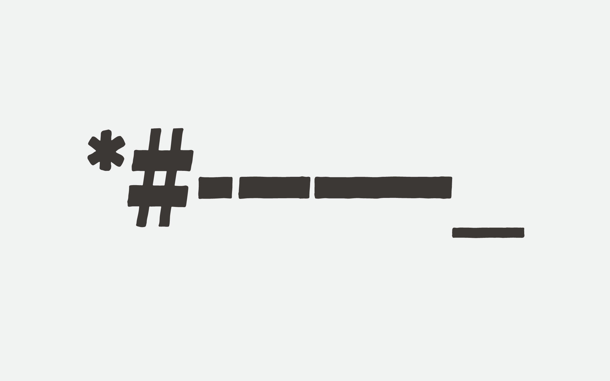
The Mighty Octothorpe #
The hastag, number sign, pound sign, or (obscurely in the US as of the 1970s) octothorpe (#) is not a tic-tac-toe board. It is not square, and leans slightly diagonally.
The # sits on the baseline and is cap height. The strokes tend to be thinner than stem width. Due to the nature of the tool I’m using, I’ve decided to use some thicker strokes, and hopefully it will work well with the color of the text.
The two horizontal strokes tend to be thicker than the vertical if there is any difference in stroke width, and then typically in high contrast or text faces. Protest is not high contrast, but in order to be condensed (or even correctly proportioned) I need to the vertical lines of my # to be thinner. So I am using the high contrast style.
[fusion_imageframe image_id=”2192″ style_type=”none” stylecolor=”” hover_type=”none” bordersize=”” bordercolor=”” borderradius=”” align=”none” lightbox=”no” gallery_id=”” lightbox_image=”” alt=”” link=”” linktarget=”_self” hide_on_mobile=”small-visibility,medium-visibility,large-visibility” class=”” id=”” animation_type=”” animation_direction=”left” animation_speed=”0.3″ animation_offset=””]http://staging.quakercreative.com//wp-content/uploads/2017/12/Punctuation-pt2-asteriskNum-1024×640.jpg[/fusion_imageframe]
Take an asterisk *
The asterisk (*) is a fun glyph, similar to the & in that type designers love to play with the form. Typically an asterisk has five or six points. It can be shaped like a star or take inspiration from flowers, and it often has subtle nuances in shape aside from the different number of points.
I decided to go fairly simple, in keeping with the rest of the Protest font. I went with a six pointed shape because it’s the easiest to draw by hand, which is what I figure would be done when maing a poster. The asterisk needs to be small. So I used the side of my marker in order to make thinner strokes, otherwise it would’ve been far too thick and chunky.
The * is a bit smaller than the ordinal letters. In some typefaces it might be close to or the same size as an ordinal, but more often than not it is fairly small. That’s what I’m doing with Protest.
The top of the * aligns with the cap height or just below, sometimes with the height of the figures and numerals which may be slightly shorter than the cap height. For this font the * aligns just below cap height. The reason for this is to not be too far away from the top of the x-height, as an asterisk will often follow lowercase letters.
Up Next
- Punctuation
§ ¶ † ‡- * # – – — _
- . , ; : ! ¡ ? ¿ ‽ … •
- ' ‘ ’ ‚ “ ” „ ′ ″ ‹ › « »
- / \ | ¦ ( ) [ ] { }
- Mathematic Symbols
- %
- + − ± × ÷ = ≠ ≈
- > < ≤ ≥ % ° ⁄
- Diacritics
Tags:
Leave a Reply