
Your cart is currently empty!
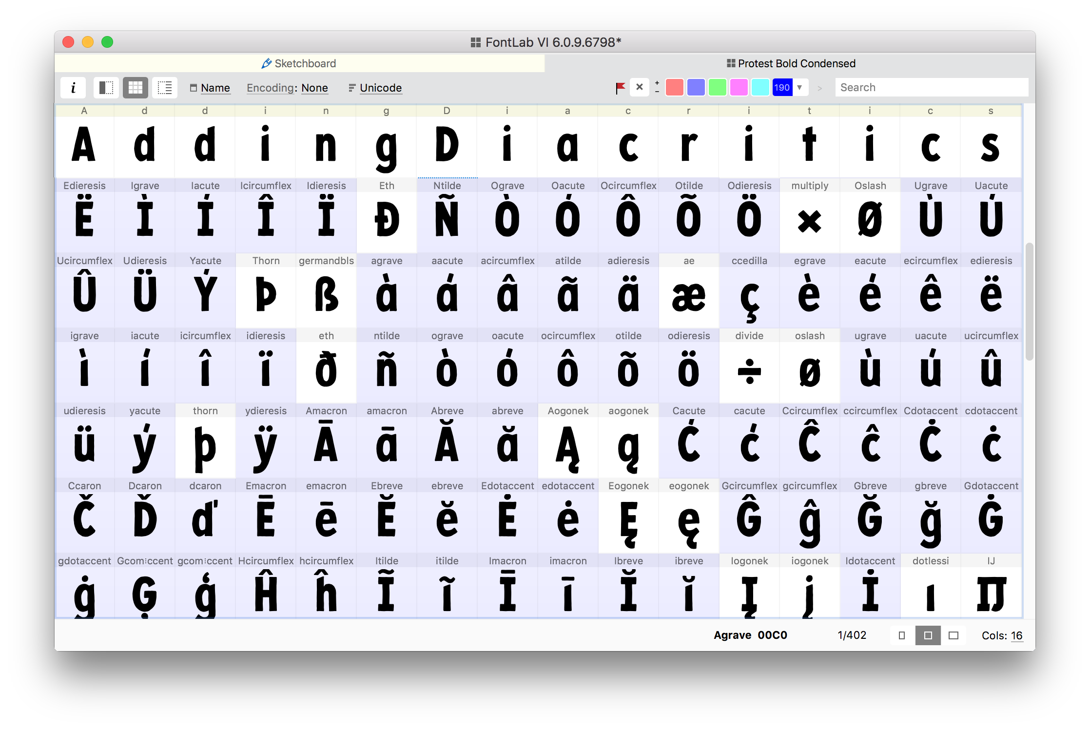
Adding Diacritics in FontLab VI
In my last blog post I wrote about doing test prints with specimen sheets and looking at typographic color. It dealt primarily with the basic Latin alphabet and figures. Now I’m ready to push into accented characters, expanding the Latin glyph set to include greater language support.
In this post I document what I did to add diacritics to my Protest font in FontLab VI, having already drawn the diacritical marks.
Copy Diacritics From Illustrator To FontLab VI
As I described in an earlier post, it’s pretty easy to go from Adobe Illustrator to FontLab VI as long as the scale is set. When copying diacritic marks from Illustrator into FontLab, I do a couple things to assure a smooth transition:
- Using my guides, I make sure the glyphs are vertically positioned in Illustrator where they need to be in relation to the glyphs they modify.
- I make a rectangle in Illustrator from the baseline to the cap height.
- I copy (and scale as appropriate) all of the diacritics and the rectangle together, and paste them onto the Sketchboard in FontLab.
- I move the whole selection until the rectangle is aligned with the baseline and cap height in FontLab.
[fusion_imageframe image_id=”2448″ max_width=”” style_type=”none” stylecolor=”” hover_type=”none” bordersize=”” bordercolor=”” borderradius=”” align=”none” lightbox=”no” gallery_id=”” lightbox_image=”” alt=”” link=”” linktarget=”_self” hide_on_mobile=”small-visibility,medium-visibility,large-visibility” class=”” id=”” animation_type=”” animation_direction=”left” animation_speed=”0.3″ animation_offset=””]http://staging.quakercreative.com//wp-content/uploads/2018/10/AddingDiacritics-01-1024×682.png[/fusion_imageframe]
From the Sketchboard FontLab VI makes it easy to add glyphs to the font, using Option+P with the desired element selected.
However, at the time of this writing, FontLab VI 6.0.9.6798 has a bug in this feature when it comes to the diacritics. If I have “Use base guide to vertically align element” selected, it will add the element as a glyph to my font, but it’s HUGE.
[fusion_imageframe image_id=”2449″ max_width=”” style_type=”none” stylecolor=”” hover_type=”none” bordersize=”” bordercolor=”” borderradius=”” align=”none” lightbox=”no” gallery_id=”” lightbox_image=”” alt=”” link=”” linktarget=”_self” hide_on_mobile=”small-visibility,medium-visibility,large-visibility” class=”” id=”” animation_type=”” animation_direction=”left” animation_speed=”0.3″ animation_offset=””]http://staging.quakercreative.com//wp-content/uploads/2018/10/AddingDiacritics-02.gif[/fusion_imageframe]
If I uncheck that option, it adds the element just fine, but the mark will be sitting on the baseline.
[fusion_imageframe image_id=”2450″ max_width=”” style_type=”none” stylecolor=”” hover_type=”none” bordersize=”” bordercolor=”” borderradius=”” align=”none” lightbox=”no” gallery_id=”” lightbox_image=”” alt=”” link=”” linktarget=”_self” hide_on_mobile=”small-visibility,medium-visibility,large-visibility” class=”” id=”” animation_type=”” animation_direction=”left” animation_speed=”0.3″ animation_offset=””]http://staging.quakercreative.com//wp-content/uploads/2018/10/AddingDiacritics-03.gif[/fusion_imageframe]
To fix this:
- I go back to the Sketchboard and choose the lowest node (or one that stands out and is easy to find). I try to remember to use the Contour > Nodes at Extremes (Opt+Cmd+J) to make sure there is a lowest node. Then I note in the Y coordinate in the Node Panel.
- Going back to the newly added glyph, I find the corresponding node and note it’s Y coordinate. (If it’s the lowest node, Y will probably now be 0, as it’s been placed on the baseline.)
- I select the whole glyph either with the Element tool (V), or double clicking with the Contour tool (A).
- Then I take the difference between the Y values of the two nodes, and use the Transform Panel to move the glyph that much along the Y axis.
Note: Append the name with “.case” for uppercase diacritics. (E.g.—”acute.case” for the uppercase acute.)
Add Anchors To Diacritics
It may be obvious, but perhaps worth noting, I like to make a list of all the letters with diacritics. For Protest, this includes: A a Æ æ C c D d E e G g H h I i IJ ij J j K k L l N n O o Ø ø R r S s T t U u W w Y y Z z.
In order to combine the diacritic marks with the letters, FontLab has to know where to place the marks in relation to the base glyphs. To do this, there needs to be a reference point on both the mark being added and the base glyph to which it is added. In FontLab, these points are called Anchors.
The Anchor can be added in the Glyph Window by going to Glyph > Add Anchor in the menu, or using the keyboard shortcut Ctrl+R. For each diacritic glyph, I’ll add an anchor at the cap height for uppercase diacritics, at x-height for lowercase, or at the baseline for marks that go exclusively below the baseline (like cedilla or dot below accent).
[fusion_imageframe image_id=”2451″ max_width=”” style_type=”none” stylecolor=”” hover_type=”none” bordersize=”” bordercolor=”” borderradius=”” align=”none” lightbox=”no” gallery_id=”” lightbox_image=”” alt=”” link=”” linktarget=”_self” hide_on_mobile=”small-visibility,medium-visibility,large-visibility” class=”” id=”” animation_type=”” animation_direction=”left” animation_speed=”0.3″ animation_offset=””]http://staging.quakercreative.com//wp-content/uploads/2018/10/AddingDiacritics-04-1024×638.png[/fusion_imageframe]
For symmetrical diacritics (e.g.—ring, dot above, macron), these anchors are aligned horizontally with the center of the mark. The center can be found by adding the far left X coordinate to the far right X coordinate, and divide by 2. However, sometimes it’s appropriate to eyeball it, especially for a hand drawn font like Protest, where even the “symmetrical” glyphs are not truly symmetrical.
For asymmetrical marks, the anchor should be horizontally aligned to the optical center of the glyphs to which it will be attached. As an example, with the acute, imagine the anchor is aligned with the optical center of the o, and move the anchor to where the top of the o should be sitting in relation to the acute. I don’t stress too much about it, because I can see a preview of it before generating the glyphs, and because it can always be tweaked.
[fusion_imageframe image_id=”2452″ max_width=”” style_type=”none” stylecolor=”” hover_type=”none” bordersize=”” bordercolor=”” borderradius=”” align=”none” lightbox=”no” gallery_id=”” lightbox_image=”” alt=”” link=”” linktarget=”_self” hide_on_mobile=”small-visibility,medium-visibility,large-visibility” class=”” id=”” animation_type=”” animation_direction=”left” animation_speed=”0.3″ animation_offset=””]http://staging.quakercreative.com//wp-content/uploads/2018/10/AddingDiacritics-05-1024×682.png[/fusion_imageframe]
The anchor under the diacritic mark should be labeled with an underscore, followed by “top” if it’s going above the letter, “bottom” if it’s going below, etc. FontLab VI will guess at what the anchor should be named, and include the underscore.
[fusion_imageframe image_id=”2453″ max_width=”” style_type=”none” stylecolor=”” hover_type=”none” bordersize=”” bordercolor=”” borderradius=”” align=”none” lightbox=”no” gallery_id=”” lightbox_image=”” alt=”” link=”” linktarget=”_self” hide_on_mobile=”small-visibility,medium-visibility,large-visibility” class=”” id=”” animation_type=”” animation_direction=”left” animation_speed=”0.3″ animation_offset=””]http://staging.quakercreative.com//wp-content/uploads/2018/10/AddingDiacritics-06-1024×682.png[/fusion_imageframe]
Add Anchors To Base Glyphs
Anchors are added to the base letters the same way as the diacritics (Ctrl+R). The name of the anchor in the base glyph needs to be the same as the corresponding anchor in the diacritic glyph, but does not have an underscore prefix in the name.
For the letter anchors, I use a vertical guide to mark the optical center. I can use the guide for both the top and bottom anchors, as there may be diacritics both above and below.
FontLab VI makes it easy to snap the anchor to the guide:
- Click on the guide and give it a name in the Guide Panel (Window > Panels > Guide).
- Click on the anchor, then click on the X value (top number) and type in the name of the guide.
- Click on the Y value and enter the x-height, cap height, or baseline as appropriate (whichever was the measurement line used to align the anchor in the diacritics meant for the letter).
[fusion_imageframe image_id=”2454″ max_width=”” style_type=”none” stylecolor=”” hover_type=”none” bordersize=”” bordercolor=”” borderradius=”” align=”none” lightbox=”no” gallery_id=”” lightbox_image=”” alt=”” link=”” linktarget=”_self” hide_on_mobile=”small-visibility,medium-visibility,large-visibility” class=”” id=”” animation_type=”” animation_direction=”left” animation_speed=”0.3″ animation_offset=””]http://staging.quakercreative.com//wp-content/uploads/2018/10/AddingDiacritics-07-1024×645.jpg[/fusion_imageframe]
[fusion_imageframe image_id=”2455″ max_width=”” style_type=”none” stylecolor=”” hover_type=”none” bordersize=”” bordercolor=”” borderradius=”” align=”none” lightbox=”no” gallery_id=”” lightbox_image=”” alt=”” link=”” linktarget=”_self” hide_on_mobile=”small-visibility,medium-visibility,large-visibility” class=”” id=”” animation_type=”” animation_direction=”left” animation_speed=”0.3″ animation_offset=””]http://staging.quakercreative.com//wp-content/uploads/2018/10/AddingDiacritics-08-1024×682.png[/fusion_imageframe]
Now if I need to move the guide (say I didn’t hit optical center), it will move the anchors along with it. I can see the marks corresponding to the anchor I’ve placed in the Glyph Window by going to View > Anchor Cloud
[fusion_imageframe image_id=”2456″ max_width=”” style_type=”none” stylecolor=”” hover_type=”none” bordersize=”” bordercolor=”” borderradius=”” align=”none” lightbox=”no” gallery_id=”” lightbox_image=”” alt=”” link=”” linktarget=”_self” hide_on_mobile=”small-visibility,medium-visibility,large-visibility” class=”” id=”” animation_type=”” animation_direction=”left” animation_speed=”0.3″ animation_offset=””]http://staging.quakercreative.com//wp-content/uploads/2018/10/AddingDiacritics-09-1024×701.png[/fusion_imageframe]
I also have letters that will have a diacritic to the right—the ď (dcaron) and ť (tcaron) in Czech, and the Ľ (Lcaron) and ľ (lcaron) in Slovak. For these I can use the same process as above, but add an anchor called “right” in the caron.salt (stylistic alternate caron) glyph, and a corresponding “right” anchor in the d, t, L, and l.
[fusion_imageframe image_id=”2457″ max_width=”” style_type=”none” stylecolor=”” hover_type=”none” bordersize=”” bordercolor=”” borderradius=”” align=”none” lightbox=”no” gallery_id=”” lightbox_image=”” alt=”” link=”” linktarget=”_self” hide_on_mobile=”small-visibility,medium-visibility,large-visibility” class=”” id=”” animation_type=”” animation_direction=”left” animation_speed=”0.3″ animation_offset=””]http://staging.quakercreative.com//wp-content/uploads/2018/10/AddingDiacritics-10-1024×682.png[/fusion_imageframe]
I made a guide called “guide” to attach the anchor to next to the letter, and again made sure both the _right and right anchors were sitting on the x-height.
[fusion_imageframe image_id=”2463″ max_width=”” style_type=”none” stylecolor=”” hover_type=”none” bordersize=”” bordercolor=”” borderradius=”” align=”none” lightbox=”no” gallery_id=”” lightbox_image=”” alt=”” link=”” linktarget=”_self” hide_on_mobile=”small-visibility,medium-visibility,large-visibility” class=”” id=”” animation_type=”” animation_direction=”left” animation_speed=”0.3″ animation_offset=””]http://staging.quakercreative.com//wp-content/uploads/2018/10/AddingDiacritics-11-1-1024×685.png[/fusion_imageframe]
Now that I have all the anchors placed, it’s time to generate the combined glyphs.
Selection-Based Generation VS
Custom Recipes
FontLab VI has a couple ways to generate glyphs using the Font > Generate Glyphs dialogue: selection-based generation (Character tab), or Custom generation (Custom tab).
Selection-Based Generation
To automatically generate glyphs using the Characters tab, I first need to select the empty glyphs in the Font Window, which can be a hit-or-miss challenge. Or—and this is what I elected to do—in a new Metrics Window (Shift+Opt+Cmd+M), paste the list of glyphs to be generated.
Then when I go to Font > Generate Glyphs, the Characters tab will show the list of glyphs, and a preview of the automatically generated glyphs.
[fusion_imageframe image_id=”2459″ max_width=”” style_type=”none” stylecolor=”” hover_type=”none” bordersize=”” bordercolor=”” borderradius=”” align=”none” lightbox=”no” gallery_id=”” lightbox_image=”” alt=”” link=”” linktarget=”_self” hide_on_mobile=”small-visibility,medium-visibility,large-visibility” class=”” id=”” animation_type=”” animation_direction=”left” animation_speed=”0.3″ animation_offset=””]http://staging.quakercreative.com//wp-content/uploads/2018/10/AddingDiacritics-12-1024×754.png[/fusion_imageframe]
Something I noticed was that not all of the correct diacritic marks were used. The lowercase ring was used on the uppercase as well, and the same happened for the caron. And it was only in some cases, but not all. I checked my anchors, and I never did get it figured out. (I also never submitted a ticket to FontLab, so it could still totally be my fault. This was for FontLab 6.0.9.6798.)
Custom Recipes
In the Custom tab, I can enter in custom glyph recipes using FontLab’s glyph recipe syntax. I like this method because this is the best way to have complete control over what is being generated, and then if anything goes wrong, I can look into the recipe(s) I wrote to see where I messed up.
The syntax is pretty easy and straightforward. FontLab’s documentation has everything needed to learn how to write it, so I won’t get into that much here. Suffice it to say it’s easy, but there are a lot of glyphs.
The syntax is basically <name of the resulting glyph> = <glyph> + <diacritic>@<name of anchor>
And the sidebearings can be set as well by adding ^ <lsb>, <rsb> where <lsb> is the left sidebearing, and <rsb> the right. These can be set to other glyphs, just like in the metrics tab.
For example, á would be:
aacute = a + acute@top ^ a, a
This makes an á by combining a and ´ by placing the acute using the “top” anchor, and sets the sidebearings to the same as a. Note: This does not make the sidebearings equal to “a” and “a” in the metrics table. Rather, it gives them the same numeric value as the sidebearings of the glyph a (for instance, 38 and 47). (FontLab, I find this irritating and counter intuitive.)
The recipe can contain more that just two components (“a” and “acute”), but each component’s placement using the @ indicator will be in relation to the last component listed, not the first component in the string.
So ǻ would be:
aringacute = a + ring@top + acute ^ a, a
If I put @top after acute, it would refer to an anchor called “top” in the ring glyph, not the a glyph. Knowing this, I can add an anchor to the ring glyph and the acute to put them together. This might look something like:
aringacute = a + ring@top + acute@acute ^ a, a
However, I’m going to do some modification after the fact anyway, so I won’t bother with that in the recipe.
Once I’ve copied my recipes from a text editor into the Custom tab, it brings up previews of the constructed glyphs. Elements in black are the first component in a recipe, brown elements are the second component, olive green the third, green the fourth, and so on.
[fusion_imageframe image_id=”2460″ max_width=”” style_type=”none” stylecolor=”” hover_type=”none” bordersize=”” bordercolor=”” borderradius=”” align=”none” lightbox=”no” gallery_id=”” lightbox_image=”” alt=”” link=”” linktarget=”_self” hide_on_mobile=”small-visibility,medium-visibility,large-visibility” class=”” id=”” animation_type=”” animation_direction=”left” animation_speed=”0.3″ animation_offset=””]http://staging.quakercreative.com//wp-content/uploads/2018/10/AddingDiacritics-13-1024×754.png[/fusion_imageframe]
As long as everything looks the way I expect, I’ll make sure the “Flag new glyphs” option is checked, and I can hit the “OK” button.
Check & Tweak
I’m using the Underware Latin Plus character set as my primary list. So I’m double checking everything by going down the list of recipes before I copy them, and going over the flagged glyphs after they’ve been generated to try to make sure I’ve not forgotten any.
(Note: I’ve missed some with every check. There are so stinking many.)
I also have the “Open new glyphs for editing” box checked when generating. So FontLab opens all those glyphs and I can look over them all. Make sure to have the “Show Mark Attachment” feature turned off, otherwise most of the glyphs will be overlapping.
[fusion_imageframe image_id=”2473″ max_width=”” style_type=”none” stylecolor=”” hover_type=”none” bordersize=”” bordercolor=”” borderradius=”” align=”none” lightbox=”no” gallery_id=”” lightbox_image=”” alt=”” link=”” linktarget=”_self” hide_on_mobile=”small-visibility,medium-visibility,large-visibility” class=”” id=”” animation_type=”” animation_direction=”left” animation_speed=”0.3″ animation_offset=””]http://staging.quakercreative.com//wp-content/uploads/2018/10/AddingDiacritics-14-1024×685.png[/fusion_imageframe]
(I had this featured turned on without noticing, and it was super frustrating. I finally had to send a ticket in for tech support to tell me what I was doing wrong. While frustrating, I’m glad is was so easy to remedy!)
[fusion_imageframe image_id=”2462″ max_width=”” style_type=”none” stylecolor=”” hover_type=”none” bordersize=”” bordercolor=”” borderradius=”” align=”none” lightbox=”no” gallery_id=”” lightbox_image=”” alt=”” link=”” linktarget=”_self” hide_on_mobile=”small-visibility,medium-visibility,large-visibility” class=”” id=”” animation_type=”” animation_direction=”left” animation_speed=”0.3″ animation_offset=””]http://staging.quakercreative.com//wp-content/uploads/2018/10/AddingDiacritics-15-1024×685.png[/fusion_imageframe]
Now I can check the result of each generated glyph, and perform minor tweaks and adjustments as necessary.
Test
Finally, test. Test, test, test. Go back to those text generation sites and make some specimen sheets to test out the new glyphs. I’m testing language by language, and looking for gaps or anomalies. And really, even after trying to double check my lists several times along the way, I still missed some and messed some up. (There’s just so many!)
Up Next
The next post will be about adding alternates to Protest. And there are a lot of alternates. Good times!
Tags:
Leave a Reply