
Your cart is currently empty!
Diacritics: Part 1
The previous series of posts focused on mathematic symbols, with the last post covering four Greek derived math symbols: Δ ∑ ∏ π (delta, sum, product, and pi). This three part series discusses most (but not all) Latin–based diacritics.
This post covers the acute, double acute, grave, circumflex, and caron ( ´ ˝ ` ˆ ˇ ). These marks are the ones that are built with diagonal strokes and asymmetric forms.
What Are Diacritics?
Basically, diacritics are glyph modifiers. They are bits added to existings glyphs to create symbols for a different sound or a different way of reading a sound.
Some diacritics simply modify where to put the emphasis in a word. Other diacritics make entirely new letters. What a diacritic means for a given glyph depends on the language in which the glyph is read.
There are about two dozen diacritic marks in Latin & Greek. Not all marks are used in every font, and Protest is no different. I’m using the Underware character set, which supports around 200 languages, but doesn’t use all the diacritic marks.
Where To Begin?
Sometimes it’s hard for me to figure out where to start, especially if I haven’t done something before. So with the diacritics I just thought I’d start with the easiest–looking and most familiar: the acute.
An Acute Case of Diacritics
The acute accent ( ´ ) seemed a good place to start, as it is the most used diacritic among Latin-based languages. For this reason, it is the one diacritic most monolingual English speakers are used to seeing.
An upward sloping (from left to right) diagonal stroke floating above a given glyph, the acute is pretty straightforward:
- It is usually thicker at the top, narrowing toward the bottom.
- The upper and lower terminals are often horizontal in sans serif typefaces, but in calligraphic faces the terminal is based on the tool and writing style.
- The acute above an uppercase glyph is sometimes tilted more horizontally or is shorter in order not to stick up too far. This is so the marks don’t crowd any descenders in a line of type above it.
Start with Polish
After I drew my acute and grave for both upper- and lowercase, and after I had drawn most of the other marks as well, I went to research the ogonek and learned something about Polish diacritics: they are slightly more detailed in their specification. That is to say, the Polish care.
Where other languages might not mind about the angle of an acute, the Polish kreska (which passes for an acute in any other setting) has a particular angle range and look. What this means is if I draw an acute and it doesn’t pass muster as a Polish kreska, then I’m failing Polish readers. But if I make a good kreska, it will pass as a good acute in any other language. (Behold the power of intersectionality!)
The kreska stands closer to vertical than most contemporary acutes. This is actually typical of acutes drawn before 1900, so the Polish have the weight of history on their side.
[fusion_imageframe image_id=”2322″ style_type=”none” stylecolor=”” hover_type=”none” bordersize=”” bordercolor=”” borderradius=”” align=”none” lightbox=”no” gallery_id=”” lightbox_image=”” alt=”” link=”” linktarget=”_self” hide_on_mobile=”small-visibility,medium-visibility,large-visibility” class=”” id=”” animation_type=”” animation_direction=”left” animation_speed=”0.3″ animation_offset=””]http://staging.quakercreative.com//wp-content/uploads/2018/05/Diacritics-pt1-acute-1024×640.jpg[/fusion_imageframe]
The kreska also seems to project from the middle of the glyph rather than center optically above it. For example, a typical acute would be opticaly centered over an O. The kreska, however, is shifted slightly more to the right. This gives the Ó the appearance of being a fruit with a leaf or stem, rather than being a head with a funny cowlick.
So I went back and re-did all my acutes. And graves. And the double acutes.
Double Acute—the Hungarumlaut
The double acute ( ˝ ) is what it sounds like. It’s two acutes. This is also known as the hungarumlaut, because in Hungarian it is used to indicate the lengthening of vowels with an umlaut (ö or ü).
While it can just be two acutes next to each other, some type designers have given their double acutes a bit of a jaunty flair. They do this by simply varying the angle of the acute on the right, so it slightly tucks into the one on the left. This seemed like not only a more lively way of designing the mark, but also very appropriate for a hand-done font, which mimics the imprecision of the hand rather than the machined perfection of a copied and pasted twin acute.
[fusion_imageframe image_id=”2326″ style_type=”none” stylecolor=”” hover_type=”none” bordersize=”” bordercolor=”” borderradius=”” align=”none” lightbox=”no” gallery_id=”” lightbox_image=”” alt=”” link=”” linktarget=”_self” hide_on_mobile=”small-visibility,medium-visibility,large-visibility” class=”” id=”” animation_type=”” animation_direction=”left” animation_speed=”0.3″ animation_offset=””]http://staging.quakercreative.com//wp-content/uploads/2018/05/Diacritics-pt1-hungarumlaut-1024×640.jpg[/fusion_imageframe]
A Grave Case of Diacritics
The grave ( ` ) is just a reflected acute.
Yep. Ta-da.
[fusion_imageframe image_id=”2325″ style_type=”none” stylecolor=”” hover_type=”none” bordersize=”” bordercolor=”” borderradius=”” align=”none” lightbox=”no” gallery_id=”” lightbox_image=”” alt=”” link=”” linktarget=”_self” hide_on_mobile=”small-visibility,medium-visibility,large-visibility” class=”” id=”” animation_type=”” animation_direction=”left” animation_speed=”0.3″ animation_offset=””]http://staging.quakercreative.com//wp-content/uploads/2018/05/Diacritics-pt1-grave-1024×640.jpg[/fusion_imageframe]
Do a Háček and Get Your Caron
The caron ( ˇ ) is kind of like a little v on top of a letter. In Czech, the language in which this mark originated, it is called a háček (pronounced kind of like “hat check”—HĂ·chĕk).
Something to note is that this mark, particularly in Czech, may have some stroke contrast. If the typeface has contrast, the háček should have proportional contrast, especially if it’s a script, handwritten, or classical typeface.
The rest of this mark’s build is directly related to the circumflex.
There is a háček variant in Czech which pairs with letters containing ascenders. This version looks kind of like an apostrophe or single prime to the right of the stem. This should not be a copy of the apostrophe, otherwise the two may be confused. According to diacritics.typo.cz, “it should be more humble, smaller, and, importantly, narrower.”
[fusion_imageframe image_id=”2323″ style_type=”none” stylecolor=”” hover_type=”none” bordersize=”” bordercolor=”” borderradius=”” align=”none” lightbox=”no” gallery_id=”” lightbox_image=”” alt=”” link=”” linktarget=”_self” hide_on_mobile=”small-visibility,medium-visibility,large-visibility” class=”” id=”” animation_type=”” animation_direction=”left” animation_speed=”0.3″ animation_offset=””]http://staging.quakercreative.com//wp-content/uploads/2018/05/Diacritics-pt1-caron-1024×640.jpg[/fusion_imageframe]
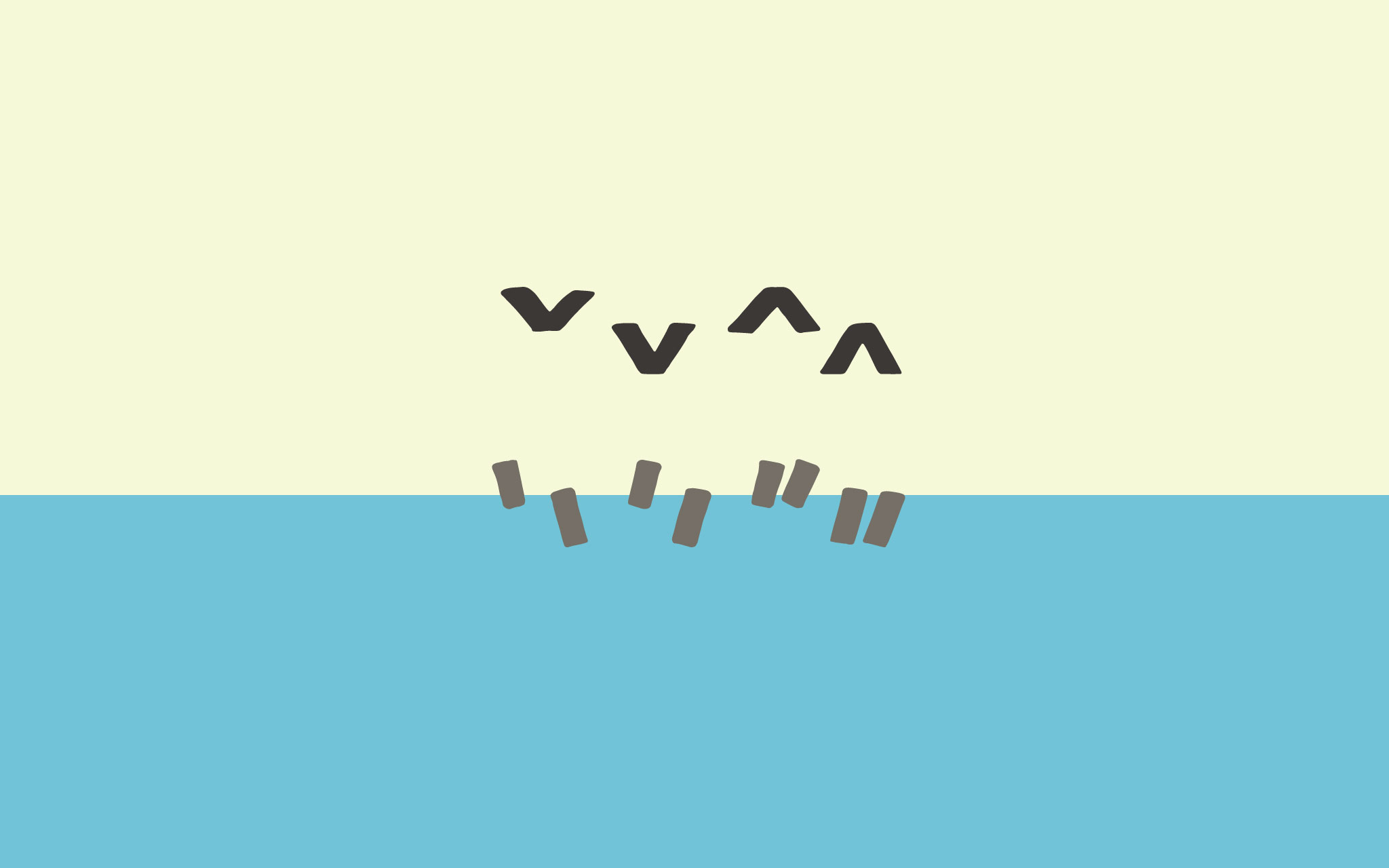
Circumflex Those Muscles
The circumflex ( ˆ ) is like a little roof. It’s normally made through a convoluted combination of the grave and acute. The strokes should be a bit thinner at the apex of this mark, so that the joint isn’t too thick. (The same is true for the vertex of the háček.)
The circumflex can be pointed on the top, or truncated (flat) on top. Given certain characteristics of Protest—being sans serif, bold, condensed, and therefore more tightly spaced—I’ve decided to got with the truncated version. The biggest reason, however, was so that it would mirror the háček, whcih needed to be truncatedin order to fit into the limited vertical space of this large x-height typeface.
The circumflex is typically symmetric, versus it’s asymmetric partner the háček. However, it seems only logical to me to draw a circumflex with just as much contrast as the háček, given that they are mirror marks, and given that Protest is a handwritten typeface. Not that it’s terribly noticeable, since this typeface is pretty low contrast, but details matter.
[fusion_imageframe image_id=”2324″ style_type=”none” stylecolor=”” hover_type=”none” bordersize=”” bordercolor=”” borderradius=”” align=”none” lightbox=”no” gallery_id=”” lightbox_image=”” alt=”” link=”” linktarget=”_self” hide_on_mobile=”small-visibility,medium-visibility,large-visibility” class=”” id=”” animation_type=”” animation_direction=”left” animation_speed=”0.3″ animation_offset=””]http://staging.quakercreative.com//wp-content/uploads/2018/05/Diacritics-pt1-circumflex-1024×640.jpg[/fusion_imageframe]
I’ll be honest, I drew the circumflex first, and made it pointed, because that was easier (and a bit more legible). Then when I had to do the háček later, I slapped my palm to my head and shook it in frustration as I realized that a pointy háček 1) doesn’t seem to be a thing and 2) wouldn’t fit very well in the limited space above the letters—especially for the uppercase.
Uppercase
Yep, there’s a difference between upper and lowercase diacritics, simply because of leading. If I’ve got a tightly spaced font (and I do), then my line spacing is going to be fairly tight as well. This is especially true at display sizes, for which Protest is designed. So if I don’t want my diacritics crashing into descenders, I need to make the marks for the uppercase a bit shorter.
Making marks shorter is easy to do for the grave, acute, and hungarumlaut. It’s not as easy for the circumflex and caron. The latter two need to be drawn opening at a wider angle to avoid making a thick blob of ink with little appendages.
[fusion_imageframe image_id=”2327″ style_type=”none” stylecolor=”” hover_type=”none” bordersize=”” bordercolor=”” borderradius=”” align=”none” lightbox=”no” gallery_id=”” lightbox_image=”” alt=”” link=”” linktarget=”_self” hide_on_mobile=”small-visibility,medium-visibility,large-visibility” class=”” id=”” animation_type=”” animation_direction=”left” animation_speed=”0.3″ animation_offset=””]http://staging.quakercreative.com//wp-content/uploads/2018/05/Diacritics-pt1-uppercase-1024×640.jpg[/fusion_imageframe]
Up Next
In Part 2 of this series I’ll cover round and symmetric marks (ring, breve, diaeresis/umlaut, and dot), and a macron thrown in for good measure.
Part 1: ´ ˝ ` ˆ ˇ- Part 2: ˚ ˘ ¨ ˙ ¯
- Part 3: ̦ ¸ ˛ ˜ ̷
Tags:
Leave a Reply