Type
-
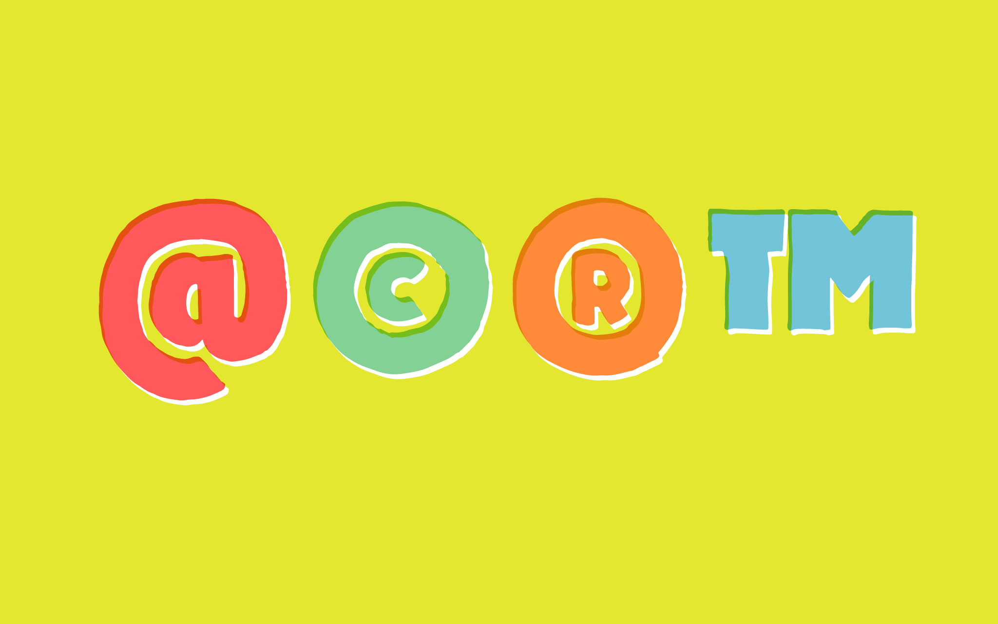
Last week I waxed poetic about ampersands. This week it’s time for (trumpet sound) commercial symbols. This is a fairly arbitrary category, and the glyphs I’ve chosen for this post all involve smaller letters. Three… (Continue reading…)
-
Last week I talked about the importance of diacritics, and why I’m designing them for my font—my first font, no less. Because they are important to me, I’m going to take the time to research… (Continue reading…)
-
I’m about to dive into diacritic design for the Protest font I’m working on. Now, I’m actually stalling for time with this post. I found I have a lot more work to do than I… (Continue reading…)
-
Last week I covered Ð, ð, Þ, and þ. This week I’m doing Ŋ, ŋ, Ɲ, ɲ, IJ, and ij. These glyphs all have the j terminal, so it made sense to draw them at… (Continue reading…)
-
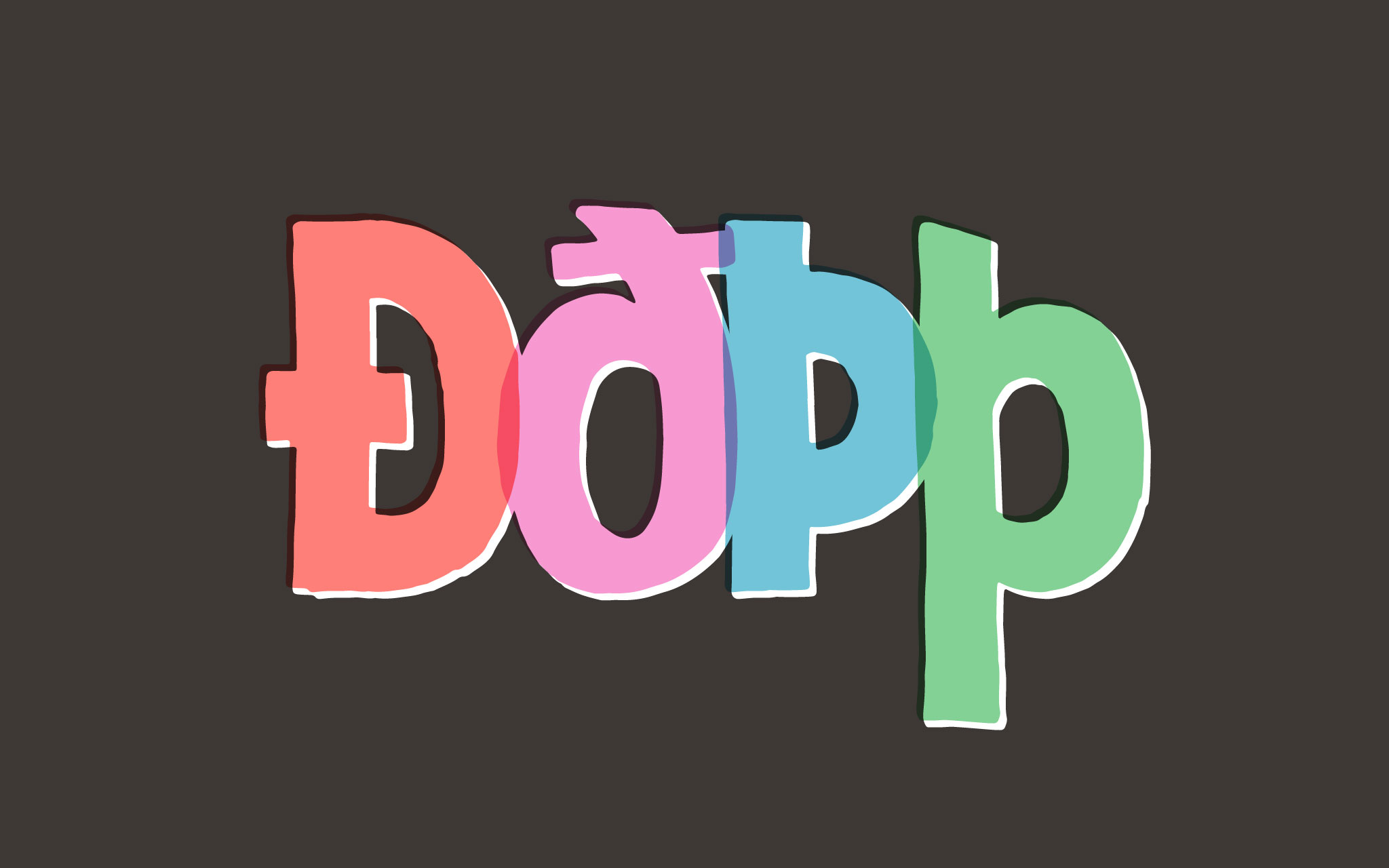
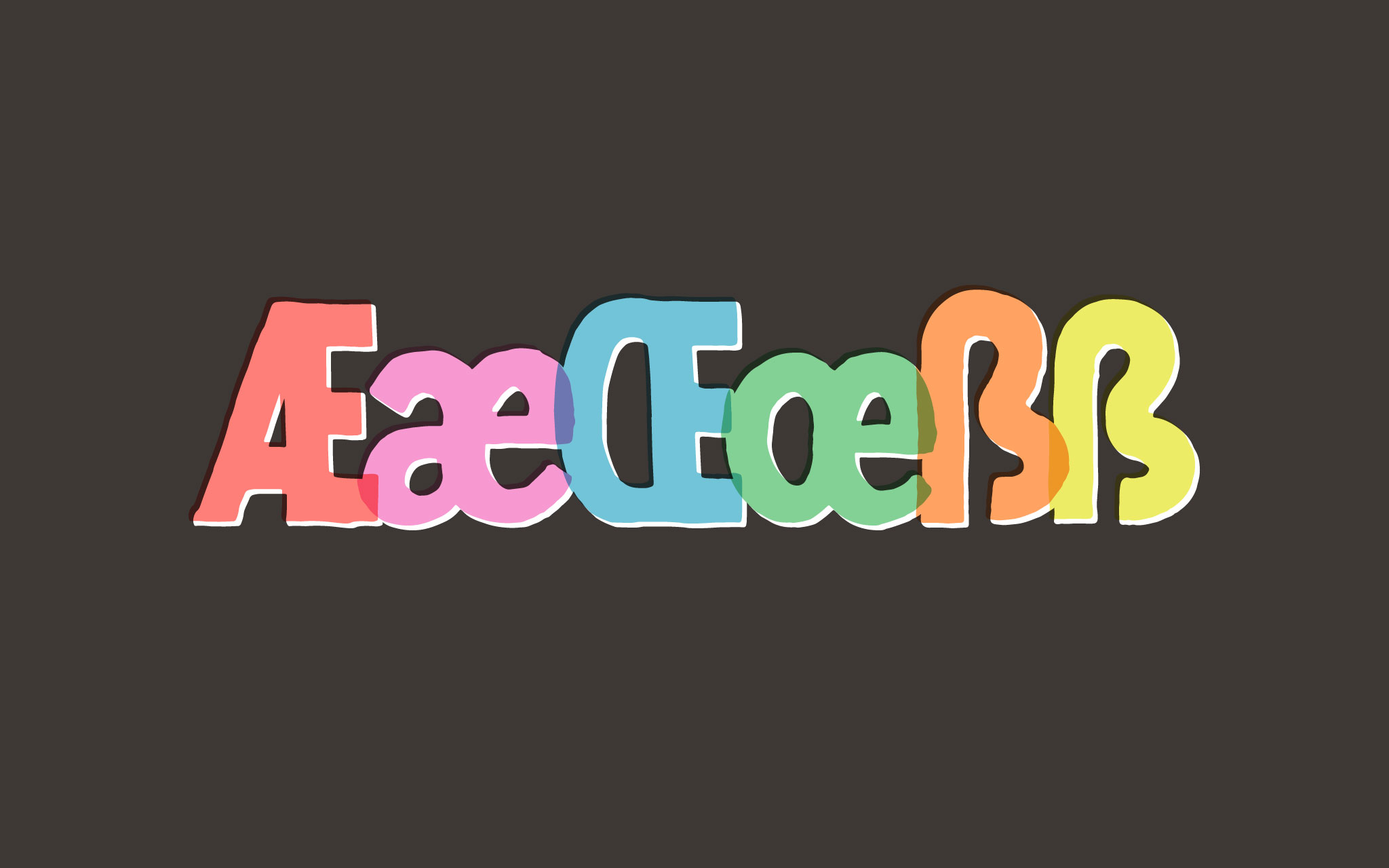
Last week I covered Æ, æ, Œ, œ, and ß. This week I drew Ð, ð, Þ, and þ. But first, a little detour back to eszett. ẞ Apparently, I was behind in my reading.… (Continue reading…)
-
Now that I’m all finished with figures, I’m going to back track—as far as forms are concerned—to alphabetic glyphs. I’m going to tackle non-English glyphs. This does not include characters with diacritics, as most diacritics… (Continue reading…)