Your cart is currently empty!

Punctuation
Part 4: Quotes
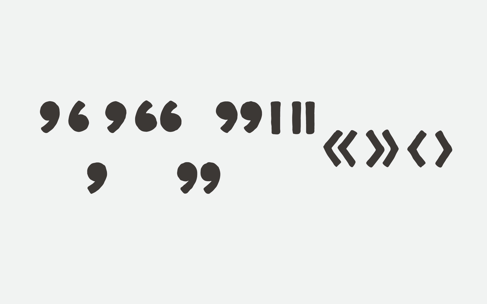
Part 3 of this punctuation series covered . , ; : ! ¡ ? ¿ … and • (but unfortunately not ‽—the interrobang). I’m back into the swing of things with Part 4, which focuses on quotes. This includes ' ‘ ’ ‚ “ ” „ ′ ″ ‹ › « and » glyphs.
Comma errata
In the last post I noted that the tail of the comma should extend down from the dot the same distance as the dot’s diameter. I also said the only time it’s permissible to have smaller tail size is when it’s a display font meant for larger sizes.
While Protest certainly is a display face, it is meant to be read at a distance, and therefore smaller sizes. So in the interest of following the type design brief, and making the punctuation a bit more readable at a distance (even though, let’s face it, who’s going to put a semicolon on their protest poster?) I’ve extended the tails of the comma and semicolon a bit.
Can I quote you?
The apostophe (') is derived from the comma, but smaller. It typically has a shorter tail, and sometimes a slightly smaller dot. (And of course, it sits up at the ascender line, not on the baseline.)
[fusion_imageframe image_id=”2208″ style_type=”none” stylecolor=”” hover_type=”none” bordersize=”” bordercolor=”” borderradius=”” align=”none” lightbox=”no” gallery_id=”” lightbox_image=”” alt=”” link=”” linktarget=”_self” hide_on_mobile=”small-visibility,medium-visibility,large-visibility” class=”” id=”” animation_type=”” animation_direction=”left” animation_speed=”0.3″ animation_offset=””]http://staging.quakercreative.com//wp-content/uploads/2018/01/Punctuation-pt4-quoteVcomma-02-1024×640.jpg[/fusion_imageframe]
The single closed quote is the same as the apostrophe. The single open quote is a closed quote rotated 180°. If the closed quote is moved down to the baseline like a comma, then it becomes an open baseline quote. Double any of these for a double quote, and the bases are mostly covered for Latin-based quotation.
[fusion_imageframe image_id=”2207″ style_type=”none” stylecolor=”” hover_type=”none” bordersize=”” bordercolor=”” borderradius=”” align=”none” lightbox=”no” gallery_id=”” lightbox_image=”” alt=”” link=”” linktarget=”_self” hide_on_mobile=”small-visibility,medium-visibility,large-visibility” class=”” id=”” animation_type=”” animation_direction=”left” animation_speed=”0.3″ animation_offset=””]http://staging.quakercreative.com//wp-content/uploads/2018/01/Punctuation-pt4-quotes-02-1024×640.jpg[/fusion_imageframe]
Guillemets
To cover the rest of the field for Latin-based quotation marks, just add guillemets (« »). Guillemets (promounced gē·(y)ə·mā) are chevron-shaped brackets pointing left or right, with single and double instances of course. They are typically smaller than x-height, though height varies between typefaces.
[fusion_imageframe image_id=”2206″ style_type=”none” stylecolor=”” hover_type=”none” bordersize=”” bordercolor=”” borderradius=”” align=”none” lightbox=”no” gallery_id=”” lightbox_image=”” alt=”” link=”” linktarget=”_self” hide_on_mobile=”small-visibility,medium-visibility,large-visibility” class=”” id=”” animation_type=”” animation_direction=”left” animation_speed=”0.3″ animation_offset=””]http://staging.quakercreative.com//wp-content/uploads/2018/01/Punctuation-pt4-guillemet-02-1024×640.jpg[/fusion_imageframe]
Optimum primes
So those dumb quotes (or neutral quotes, if you want to be nice) used on typewriters, while not suitable for use with quotations are more than appropriate in coding and to denote feet and inches, minutes and seconds. These are also known as primes. Primes and neutral quotes are separate glyphs in unicode, but the same in form. (However, some designers angle their primes, further ostracizing the socially awkward code monkeys of the type world, the neutral quotes.)
Up Next
- Punctuation
§ ¶ † ‡- * # – – — _
- . , ; : ! ¡ ? ¿ ‽ … •
- ' ‘ ’ ‚ “ ” „ ′ ″ ‹ › « »
- / \ | ¦ ( ) [ ] { }
- Mathematic Symbols
- + − ± × ÷ = ≠ ≈
- > < ≤ ≥ % ° ⁄
- Diacritics
Tags:

Leave a Reply