
Your cart is currently empty!
Letterlike Symbols
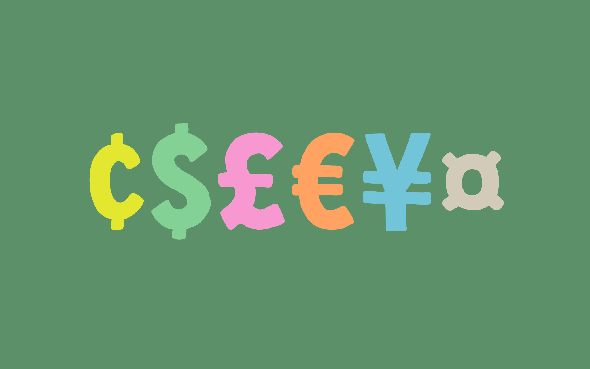
Part 4: Currency
The last post, Part 3, covered number related symbols: ordinals, superscript figures, and the numero abbreviation (№). This last post in the four part series on letterlike symbols is about the ¢, $, £, €, ¥, and ¤ signs.
$ and ¢
The dollar ($) and cent (¢) signs are based on the letters S and c respectively. The ¢ is just a c with a vertical bar through it. The $, on the other hand, is often slightly varied. Many typefaces use a smaller or narrower S. I have opted to use the same size S.
[fusion_imageframe image_id=”2174″ style_type=”none” stylecolor=”” hover_type=”none” bordersize=”” bordercolor=”” borderradius=”” align=”none” lightbox=”no” gallery_id=”” lightbox_image=”” alt=”” link=”” linktarget=”_self” hide_on_mobile=”small-visibility,medium-visibility,large-visibility” class=”” id=”” animation_type=”” animation_direction=”left” animation_speed=”0.3″ animation_offset=””]http://staging.quakercreative.com//wp-content/uploads/2017/11/currency-centdollar-02-1024×640.jpg[/fusion_imageframe]
A vertical line straight through letters as thick as these clogs up the counters. To solve this I go with a well accepted stylistic variant, just drawing the the bar where it enters and exits the letter.
¥
Like $ and ¢, the yen (¥) is based on another letter with bars through. The Y may, like the S for the $ sign, be smaller or narrower. Again I’m opting to go with the same size.
[fusion_imageframe image_id=”2178″ style_type=”none” stylecolor=”” hover_type=”none” bordersize=”” bordercolor=”” borderradius=”” align=”none” lightbox=”no” gallery_id=”” lightbox_image=”” alt=”” link=”” linktarget=”_self” hide_on_mobile=”small-visibility,medium-visibility,large-visibility” class=”” id=”” animation_type=”” animation_direction=”left” animation_speed=”0.3″ animation_offset=””]http://staging.quakercreative.com//wp-content/uploads/2017/11/currency-yen-02-1024×640.jpg[/fusion_imageframe]
The two horizontal bars need to be far enough up off the baseline to have a significant gap below. This means the top pf the two bars may encroach on the vertex of the fork in the Y. Some typefaces even split the upper bar, leaving a gap for the crotch of the vertex. The Y is such on this typeface that the upper bar sits over the joint and doesn’t encroach on the gap in the vertex.
As far as the width of the bars, some typefaces choose to make them narrower than the Y, and some the same width. I’ve made mine the same width.
€
The euro (€) is based on a cap C, but not quite. For more complex or high contrast serif typefaces, the C for this symbol is usually simplified. The aperture in the C (the space in the opening on the right) needs to be larger to accomodate the two horizontal bars in the middle.
[fusion_imageframe image_id=”2175″ style_type=”none” stylecolor=”” hover_type=”none” bordersize=”” bordercolor=”” borderradius=”” align=”none” lightbox=”no” gallery_id=”” lightbox_image=”” alt=”” link=”” linktarget=”_self” hide_on_mobile=”small-visibility,medium-visibility,large-visibility” class=”” id=”” animation_type=”” animation_direction=”left” animation_speed=”0.3″ animation_offset=””]http://staging.quakercreative.com//wp-content/uploads/2017/11/currency-euro-02-1024×640.jpg[/fusion_imageframe]
The two horizontal bars should not enter the aperture, nor should they protrude very far beyond the left side of the C, in order to be visually balanced.
The components of the C and bars should be taken together to make a sort of rounded E.
£
The pound sign (£) is based on a particular style L, not italic or script per se. Its beautiful and pecular structure leaves some room for variation at the joint and base. I’ve chosen to fashion mine similarly to Helvetica and Arial, with the wavy base.
[fusion_imageframe image_id=”2176″ style_type=”none” stylecolor=”” hover_type=”none” bordersize=”” bordercolor=”” borderradius=”” align=”none” lightbox=”no” gallery_id=”” lightbox_image=”” alt=”” link=”” linktarget=”_self” hide_on_mobile=”small-visibility,medium-visibility,large-visibility” class=”” id=”” animation_type=”” animation_direction=”left” animation_speed=”0.3″ animation_offset=””]http://staging.quakercreative.com//wp-content/uploads/2017/11/currency-pound-02-1024×640.jpg[/fusion_imageframe]
The pound has a single horizontal bar, which is a bit thicker than the bars on the euro and yen in this font (though not by much), to keep the overall color consistent.
¤
The currency symbol (¤) is about the same height and weight as the trade mark (™) symbol. Unlike the ™ it sits lower, and is often optically centered vertically. It’s pretty straight forward.
[fusion_imageframe image_id=”2177″ style_type=”none” stylecolor=”” hover_type=”none” bordersize=”” bordercolor=”” borderradius=”” align=”none” lightbox=”no” gallery_id=”” lightbox_image=”” alt=”” link=”” linktarget=”_self” hide_on_mobile=”small-visibility,medium-visibility,large-visibility” class=”” id=”” animation_type=”” animation_direction=”left” animation_speed=”0.3″ animation_offset=””]http://staging.quakercreative.com//wp-content/uploads/2017/11/currency-scarab-02-1024×640.jpg[/fusion_imageframe]
Up Next
Next up is a five part series on punctuation!
- Punctuation
- § ¶ † ‡
- * # – – — _
- . , ; : ! ¡ ? ¿ ‽ … •
- ' ‘ ’ ‚ “ ” „ ′ ″ ‹ › « »
- / \ | ¦ ( ) [ ] { }
- Mathematic Symbols
- + − ± × ÷ = ≠ ≈
- > < ≤ ≥ % ° ⁄
- Diacritics
Leave a Reply