
Your cart is currently empty!
Digitizing Hand Drawn Glyphs
Now that I’m finished drawing all the glyphs for my Protest font (for more on that, see my last 38 blog posts), it’s time to digitize!
I’d be lying if I said I drew everything over the last year and just now started digitizing. I’ve been digitizing as I go in order to make the featured images for my blog posts. Digitizing as I go has been helpful, because it allows me to take a closer look at each of the forms, which can inform the next forms I draw.
So I’m just going to break down the process I’ve used thus far.
Disclaimer: This is just how I’ve been doing things this year, and is by no means the way this has to be done. In fact, there are definitely some things I would change for the next time I make a hand drawn font. Work the way that works best for you (and certainly learn from my mistakes).
Standardize Drawing
To Make Digitizing Easier
I’m not sure if I mentioned this in any of my previousl blog posts (oops), but after drawing a few letters I quickly dtermined my cap line, x-height, and descender line. Then I went into In-Design and made a template with some guidelines. These guidelines are in a light cyan, so they don’t get picked up very easily when I digitize. I’d print these guidelines on my paper, and then draw my glyphs.
These printed guidelines meant that all of my drawn letters are in proportion to one another across all of the pages.
[fusion_imageframe image_id=”2356″ max_width=”” style_type=”none” stylecolor=”” hover_type=”none” bordersize=”” bordercolor=”” borderradius=”” align=”none” lightbox=”no” gallery_id=”” lightbox_image=”” alt=”” link=”” linktarget=”_self” hide_on_mobile=”small-visibility,medium-visibility,large-visibility” class=”” id=”” animation_type=”” animation_direction=”left” animation_speed=”0.3″ animation_offset=””]http://staging.quakercreative.com//wp-content/uploads/2018/09/Digitizing-01-1024×711.jpg[/fusion_imageframe]
Going From Paper To Screen
If I had the choice, I’d be scanning everything in. Because this font is meant to be poster sized, I’ve been drawing these glyphs on 12.5 inch by 18 inch paper. This is probably larger than the norm, and is certainly larger than I’d worked in the past. Due to the size of the paper, I was not able to easily scan the sheets. So I took photos with my iPhone.
[fusion_imageframe image_id=”2357″ max_width=”” style_type=”none” stylecolor=”” hover_type=”none” bordersize=”” bordercolor=”” borderradius=”” align=”none” lightbox=”no” gallery_id=”” lightbox_image=”” alt=”” link=”” linktarget=”_self” hide_on_mobile=”small-visibility,medium-visibility,large-visibility” class=”” id=”” animation_type=”” animation_direction=”left” animation_speed=”0.3″ animation_offset=””]http://staging.quakercreative.com//wp-content/uploads/2018/09/Digitizing-02-1024×768.jpg[/fusion_imageframe]
Photos aren’t perfect. Even with an overhead rig mounting a camera at the perfect position above my work surface (note: the position is never perfect) the paper can still have subtle curl, or things might be slightly off. Thankfully the world has Photoshop.
Prepping Images In Photoshop
I open the photos in Photoshop and drag guides to the middle of each side of the sheet in the photo.
[fusion_imageframe image_id=”2370″ max_width=”” style_type=”none” stylecolor=”” hover_type=”none” bordersize=”” bordercolor=”” borderradius=”” align=”none” lightbox=”no” gallery_id=”” lightbox_image=”” alt=”” link=”” linktarget=”_self” hide_on_mobile=”small-visibility,medium-visibility,large-visibility” class=”” id=”” animation_type=”” animation_direction=”left” animation_speed=”0.3″ animation_offset=””]http://staging.quakercreative.com//wp-content/uploads/2018/09/Digitizing-03-1024×625.png[/fusion_imageframe]
Next, I copy the whole thing (Cmd+A) and paste it into a new layer, then convert it to greyscale.
[fusion_imageframe image_id=”2359″ max_width=”” style_type=”none” stylecolor=”” hover_type=”none” bordersize=”” bordercolor=”” borderradius=”” align=”none” lightbox=”no” gallery_id=”” lightbox_image=”” alt=”” link=”” linktarget=”_self” hide_on_mobile=”small-visibility,medium-visibility,large-visibility” class=”” id=”” animation_type=”” animation_direction=”left” animation_speed=”0.3″ animation_offset=””]http://staging.quakercreative.com//wp-content/uploads/2018/09/Digitizing-04-1024×625.png[/fusion_imageframe]
Then I transform the whole layer by rotating if appropriate…
[fusion_imageframe image_id=”2360″ max_width=”” style_type=”none” stylecolor=”” hover_type=”none” bordersize=”” bordercolor=”” borderradius=”” align=”none” lightbox=”no” gallery_id=”” lightbox_image=”” alt=”” link=”” linktarget=”_self” hide_on_mobile=”small-visibility,medium-visibility,large-visibility” class=”” id=”” animation_type=”” animation_direction=”left” animation_speed=”0.3″ animation_offset=””]http://staging.quakercreative.com//wp-content/uploads/2018/09/Digitizing-05-1024×625.png[/fusion_imageframe]
…and then use Transform > Perspective to move the corners of the paper so they line up with the guides.
[fusion_imageframe image_id=”2361″ max_width=”” style_type=”none” stylecolor=”” hover_type=”none” bordersize=”” bordercolor=”” borderradius=”” align=”none” lightbox=”no” gallery_id=”” lightbox_image=”” alt=”” link=”” linktarget=”_self” hide_on_mobile=”small-visibility,medium-visibility,large-visibility” class=”” id=”” animation_type=”” animation_direction=”left” animation_speed=”0.3″ animation_offset=””]http://staging.quakercreative.com//wp-content/uploads/2018/09/Digitizing-06-1024×625.png[/fusion_imageframe]
Once the page lines up, I’ll double check to make sure it’s true by inserting guides near the top and bottom, lining them up with the upper- and lowermost guidelines in the image.
[fusion_imageframe image_id=”2362″ max_width=”” style_type=”none” stylecolor=”” hover_type=”none” bordersize=”” bordercolor=”” borderradius=”” align=”none” lightbox=”no” gallery_id=”” lightbox_image=”” alt=”” link=”” linktarget=”_self” hide_on_mobile=”small-visibility,medium-visibility,large-visibility” class=”” id=”” animation_type=”” animation_direction=”left” animation_speed=”0.3″ animation_offset=””]http://staging.quakercreative.com//wp-content/uploads/2018/09/Digitizing-07-1024×625.png[/fusion_imageframe]
If it looks good, then I’ll use the crop tool with the guides to crop the image to the edges of the paper.
[fusion_imageframe image_id=”2363″ max_width=”” style_type=”none” stylecolor=”” hover_type=”none” bordersize=”” bordercolor=”” borderradius=”” align=”none” lightbox=”no” gallery_id=”” lightbox_image=”” alt=”” link=”” linktarget=”_self” hide_on_mobile=”small-visibility,medium-visibility,large-visibility” class=”” id=”” animation_type=”” animation_direction=”left” animation_speed=”0.3″ animation_offset=””]http://staging.quakercreative.com//wp-content/uploads/2018/09/Digitizing-08-1024×625.png[/fusion_imageframe]
Finally, I can use adjust the curves to make it a high contrast black and white, which eliminates the printed guidelines and makes it ready to trace in Illustrator. If there are any dark areas left over along the edges or corners, or any problematic pencil notes or guidelines, I can use the dodge tool to touch up those areas.
[fusion_imageframe image_id=”2364″ max_width=”” style_type=”none” stylecolor=”” hover_type=”none” bordersize=”” bordercolor=”” borderradius=”” align=”none” lightbox=”no” gallery_id=”” lightbox_image=”” alt=”” link=”” linktarget=”_self” hide_on_mobile=”small-visibility,medium-visibility,large-visibility” class=”” id=”” animation_type=”” animation_direction=”left” animation_speed=”0.3″ animation_offset=””]http://staging.quakercreative.com//wp-content/uploads/2018/09/Digitizing-09-1024×625.png[/fusion_imageframe]
Also, I have most of these steps saved as Actions so I can automate and batch multiple images.
Going From Raster To Vetor
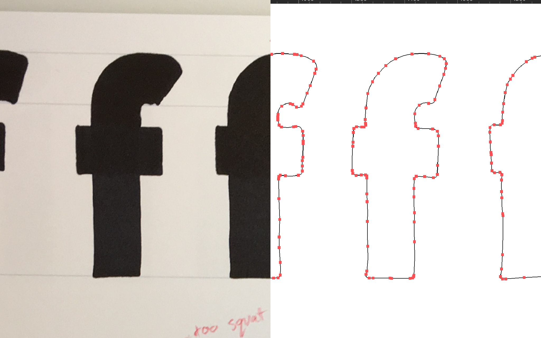
Now that I have a serviceable image, I need to vectorize it. The question is whether to use Adobe Illustrator’s Live Trace feature, or to autotrace directly in FontLab VI.
In the case of Protest, I’ve already been using Illustrator as I go in order to do the featured images on my blog. There’s no sense throwing away all that work, so I figured I’d use it. However, FontLab will presumably do things like make all my BCPs orthoganal and other such niceties that are preferred for type design but ignored in an environment like Illustrator, right? It wouldn’t take so much time to retrace if it meant I didn’t have to go back in and clean things up, would it?
[fusion_imageframe image_id=”2375″ max_width=”” style_type=”none” stylecolor=”” hover_type=”none” bordersize=”” bordercolor=”” borderradius=”” align=”none” lightbox=”no” gallery_id=”” lightbox_image=”” alt=”” link=”” linktarget=”_self” hide_on_mobile=”small-visibility,medium-visibility,large-visibility” class=”” id=”” animation_type=”” animation_direction=”left” animation_speed=”0.3″ animation_offset=””]http://staging.quakercreative.com//wp-content/uploads/2018/09/Digitizing-11-1024×693.jpg[/fusion_imageframe]
Adobe Illustrator vs. FontLab VI
Turns out the autotrace in FontLab is better suited to cleaner type designs. It is not meant for characters with as much character as this hand drawn marker style font. The precision in Illustrator is (unsurprisingly) far superior. And it turns out the orthogonality is a moot point. As long as the BCPs (Bezier Control Points) aren’t doing anything too squirrelly, it doesn’t matter.
So I can now take all of my vectors from Illustrator, and copy and paste them into FontLab. Which, by the way, is supported, and is awesome.
Up Next
In the next post I’ll go into how to get the glyphs from Illustrator into FontLab, and what to do with them once they’re there.
Leave a Reply