
Your cart is currently empty!
Adding Glyphs To
FontLab VI
In my previous post I walked through my process of digitizing hand drawn glyphs. For a typeface that’s supposed to look hand drawn like Protest, digitizing using Adobe Illustrator’s Image Trace seemed to yield the best results.
In this post I’ll go over how I moved from Illustrator into FontLab VI.
Standardize Digitizing To Make Importing Easier
Remember those guidelines I’d been using when I drew the glyphs? I’ve been using those same guidelines in Illustrator as well. So all of the images were traced at the same scale.
One of the nice things about FontLab is that it allows outlines copied in Illustrator to be pasted in FontLab VI. I need the outlines I copy from Illustrator to be at the correct scale when I paste them into FontLab.
FontLab uses guidelines for the font to mark the relative locations of the ascender line, cap line, x-height, and descender line. I just have to make sure the guidelines in FontLab are the same as the guidelines I’ve been using thus far when drawing the glyphs and putting them in Illustrator.
Unfortunately, when I set up the Illustrator files, I was thinking about the featured images for my blog, not the font file. So the scale is a bit different. As long as the guidelines are all the same proportion, however, I just have to scale the glyphs to match the new space. No big deal.
Figuring Out Scale
If this font were made on metal slugs of type, all of the slugs would need to be the same height. The UPM (Units Per eM) would be the distance from the bottom to the top of the face of the slug, and all of the glyphs would have to fit within that height (for all intents and purposes). In a digital space, this is the height of the imaginary box containing each glyph. The easiest way to work in FontLab (for me) is with a UPM of 1000. Now I have to translate the guidelines in Illustrator into that round number space.
If I were to stack my guidelines, and include glyphs with descenders and uppercase with diacritics, as well as some wiggle room, how much vertical space would that be? Basically I’m figuring out the minimum comfortable linespacing with my existing guidelines in Illustrator. Whatever the distance is from descender to cap diacritic, plus a little buffer for safe space, that is the number I will need to map to the 1000 UPM space in FontLab.
After I found that number I figured out that I would need to scale my Illustrator outlines by about 192% before copying them to FontLab.
Now, I may have fudged my numbers just a hair, in order to make the descender, x-height, and cap height nice round numbers. The good thing is, this is a very wobbly hand drawn font, so the fudging works just fine.
The next font I design will be set up with this 1000 UPM space in mind from the start, so I don’t have to fudge any numbers or do any scaling.
Setting Up A New Font File
When I set up the new font file in FontLab, the first thing I did was set up my UPM and the placement of each guideline (descender, baseline, x-height, cap, and ascender).
[fusion_imageframe image_id=”2381″ max_width=”” style_type=”none” stylecolor=”” hover_type=”none” bordersize=”” bordercolor=”” borderradius=”” align=”none” lightbox=”no” gallery_id=”” lightbox_image=”” alt=”” link=”” linktarget=”_self” hide_on_mobile=”small-visibility,medium-visibility,large-visibility” class=”” id=”” animation_type=”” animation_direction=”left” animation_speed=”0.3″ animation_offset=””]http://staging.quakercreative.com//wp-content/uploads/2018/09/ImportingToFontLab-01-1024×828.png[/fusion_imageframe]
[fusion_imageframe image_id=”2382″ max_width=”” style_type=”none” stylecolor=”” hover_type=”none” bordersize=”” bordercolor=”” borderradius=”” align=”none” lightbox=”no” gallery_id=”” lightbox_image=”” alt=”” link=”” linktarget=”_self” hide_on_mobile=”small-visibility,medium-visibility,large-visibility” class=”” id=”” animation_type=”” animation_direction=”left” animation_speed=”0.3″ animation_offset=””]http://staging.quakercreative.com//wp-content/uploads/2018/09/ImportingToFontLab-02-1024×828.png[/fusion_imageframe]
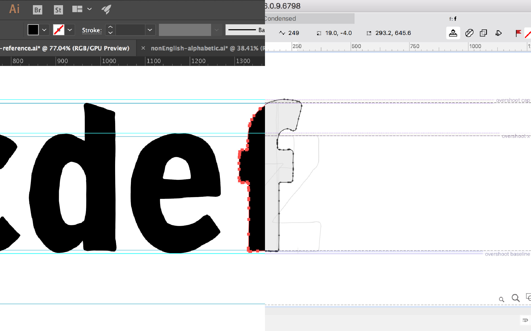
I also added guides for overshoot below the baseline, above the x-height, and above the cap height.
[fusion_imageframe image_id=”2383″ max_width=”” style_type=”none” stylecolor=”” hover_type=”none” bordersize=”” bordercolor=”” borderradius=”” align=”none” lightbox=”no” gallery_id=”” lightbox_image=”” alt=”” link=”” linktarget=”_self” hide_on_mobile=”small-visibility,medium-visibility,large-visibility” class=”” id=”” animation_type=”” animation_direction=”left” animation_speed=”0.3″ animation_offset=””]http://staging.quakercreative.com//wp-content/uploads/2018/09/ImportingToFontLab-03-1024×683.png[/fusion_imageframe]
I set these same guides in a space that FontLab VI calls the “Sketchboard.” This is a space where I can copy and paste glyphs and various elements, mess around with stuff, draw things, and then move them to the glyph palette when ready.
Pasting Glyphs Into FontLab from Illustrator
This part is fairly straightforward. I can just copy in Illustrator and paste in FontLab. However, because of my odd setup, I had to scale my glyphs 192% before copying.
When pasting, I want to paste into the Sketchboard. This way I can copy and paste many glyphs at a time, instead of having to switch back and forth between programs hundreds of times.
I try to have each glyph edited and dialed in as much as I can in Illustrator before moving to FontLab. There are, however, some things that need to be cleaned up, which I can do in the Sketchboard before moving the elements into their respective glyphs in the glyph palette.
A Note About FontLab’s New Tools & Interface
FontLab VI has tried to make its interface more familiar to Adobe users, and as such has changed many of the shortcuts and tools to match their Adobe counterparts. This is great! It makes FontLab far more intuitive for anyone who uses Adobe software.
Adobe users will be familiar with two arrow options: the black arrow (Selection tool) and the white arrow (Direct Selection tool). FontLab also has these arrows, and they have the same shortcut keys (V for the black arrow and A for the white). However, these are not the same tools!
The black arrow in FontLab is the Element tool, and the white arrow is the Contour tool. Both will seem to do the same thing as their look-alike counterparts in Adobe, but not exactly, and with very different results.
The black arrow (Element tool) will select all of the outlines that are a part of what would be called a “compound path” in Illustrator. These are considered a unique element in an inaccessible library compiled by FontLab to help make the font. I say inaccessible because while the library exists, it’s not like a Creative Cloud library where elements can be added and deleted by the user. It’s (as far as I can tell) mostly for the benefit of the program. Also as far as I can tell, once an element is created, it doesn’t go away.
An Element can be edited, and will be edited, when selected with the black arrow Element tool in FontLab. If I use this tool to copy or cut an element, when I paste it a new element is created. The elements are used in other places down the line, and can be a useful tool for creating and managing a font. However, if the library is clogged with excessive iterations of an element (from copying or cutting and pasting), then this element library is not longer useful, it’s just a waste of space. All that to say, DON’T use the black arrow Element tool in FontLab VI!
Use the white arrow (Contour tool) for selecting. If you need to select more than just a single node or segment, double click with the Contour tool to select the whole path.
Separating elements
When I first paste the simple Anglo-centric alphabet into FontLab’s Sketchboard, the glyphs are all considered one thing.
[fusion_imageframe image_id=”2384″ max_width=”” style_type=”none” stylecolor=”” hover_type=”none” bordersize=”” bordercolor=”” borderradius=”” align=”none” lightbox=”no” gallery_id=”” lightbox_image=”” alt=”” link=”” linktarget=”_self” hide_on_mobile=”small-visibility,medium-visibility,large-visibility” class=”” id=”” animation_type=”” animation_direction=”left” animation_speed=”0.3″ animation_offset=””]http://staging.quakercreative.com//wp-content/uploads/2018/09/ImportingToFontLab-04-1024×683.png[/fusion_imageframe]
I can use Shift+Command+G to ungroup, just like in Illustrator, and it will ungroup some of them. Some are still considered part of the same element, and need to be separated.
[fusion_imageframe image_id=”2385″ max_width=”” style_type=”none” stylecolor=”” hover_type=”none” bordersize=”” bordercolor=”” borderradius=”” align=”none” lightbox=”no” gallery_id=”” lightbox_image=”” alt=”” link=”” linktarget=”_self” hide_on_mobile=”small-visibility,medium-visibility,large-visibility” class=”” id=”” animation_type=”” animation_direction=”left” animation_speed=”0.3″ animation_offset=””]http://staging.quakercreative.com//wp-content/uploads/2018/09/ImportingToFontLab-05-1024×683.png[/fusion_imageframe]
This is where using the Contour tool (white arrow, shortcut key A) is important. I double click on the paths I want to separate out as their own glyphs, then use Command+X to cut them. I hit V to shift to the Element tool, click outside any path area to make sure no other paths are highlighted in any way, then paste back onto the sketchboard.
Cleaning Up
When designing type, it’s always a good practice to have nodes at extremes. This means there should be a node at the upper-, lower-, left-, and right-most points on any given curve. There should not be BCPs (Bezier control points, a.k.a. handles), forcing a curve into its most extreme point.
FontLab VI has a handy-dandy tool to make certain there are nodes at the extrema without screwing up the shape of the curves. It’s really nice. Select the glyph and use “Nodes at Extremes,” which can be found in the Contour menu, near the bottom. The keyboard shortcut is Command+Option+J.
For a hand drawn font like Protest, after adding nodes at extremes, it’s good to clean up any unnecessary points. The Clean Up feature, also found in the Contour menu, works pretty well. Sometimes it cleans up a bit too much, and the nice wobble I want for an organic form gets lost. In which case I simply undo, and edit some of the points manually.
A note, the Simplify menu item goes a lot further than the Clean Up feature, so I don’t recommend using that for this kind of work.
Moving From Sketchboard To Glyph
Supposedly FontLab can use OCR to recognize glyphs automatically after pasting into the Sketchboard. However, this feature is far from perfect, and with as many wobbly and varied nodes as my hand drawn glyphs have, this feature didn’t work for Protest.
That’s okay though, because it’s easy to move an element from Sketchboard to glyph. Select the glyph and hit Control+P to place the element as a glyph. Then enter the standard name in the box. Most character names are listed in an autocomplete feature, making it easy to find the right one. If it doesn’t pop up, I need to double check I’m using the right one. Or I can enter the unicode name.
[fusion_imageframe image_id=”2386″ max_width=”” style_type=”none” stylecolor=”” hover_type=”none” bordersize=”” bordercolor=”” borderradius=”” align=”none” lightbox=”no” gallery_id=”” lightbox_image=”” alt=”” link=”” linktarget=”_self” hide_on_mobile=”small-visibility,medium-visibility,large-visibility” class=”” id=”” animation_type=”” animation_direction=”left” animation_speed=”0.3″ animation_offset=””]http://staging.quakercreative.com//wp-content/uploads/2018/09/ImportingToFontLab-06-1024×624.png[/fusion_imageframe]
Soon I’ve got a whole heap of glyphs added to my font! Just check the font window to see all the glyphs. If it looks like some that I’ve added are empty, I might need to click on them and adjust the sidebearings, as they might be outside the glyph’s bounding box. I’ll cover sidebearings and the metrics panel in the next post.
Up Next
In the next blog post I’ll cover the ever important topic of spacing. Woot!
Leave a Reply