
Your cart is currently empty!
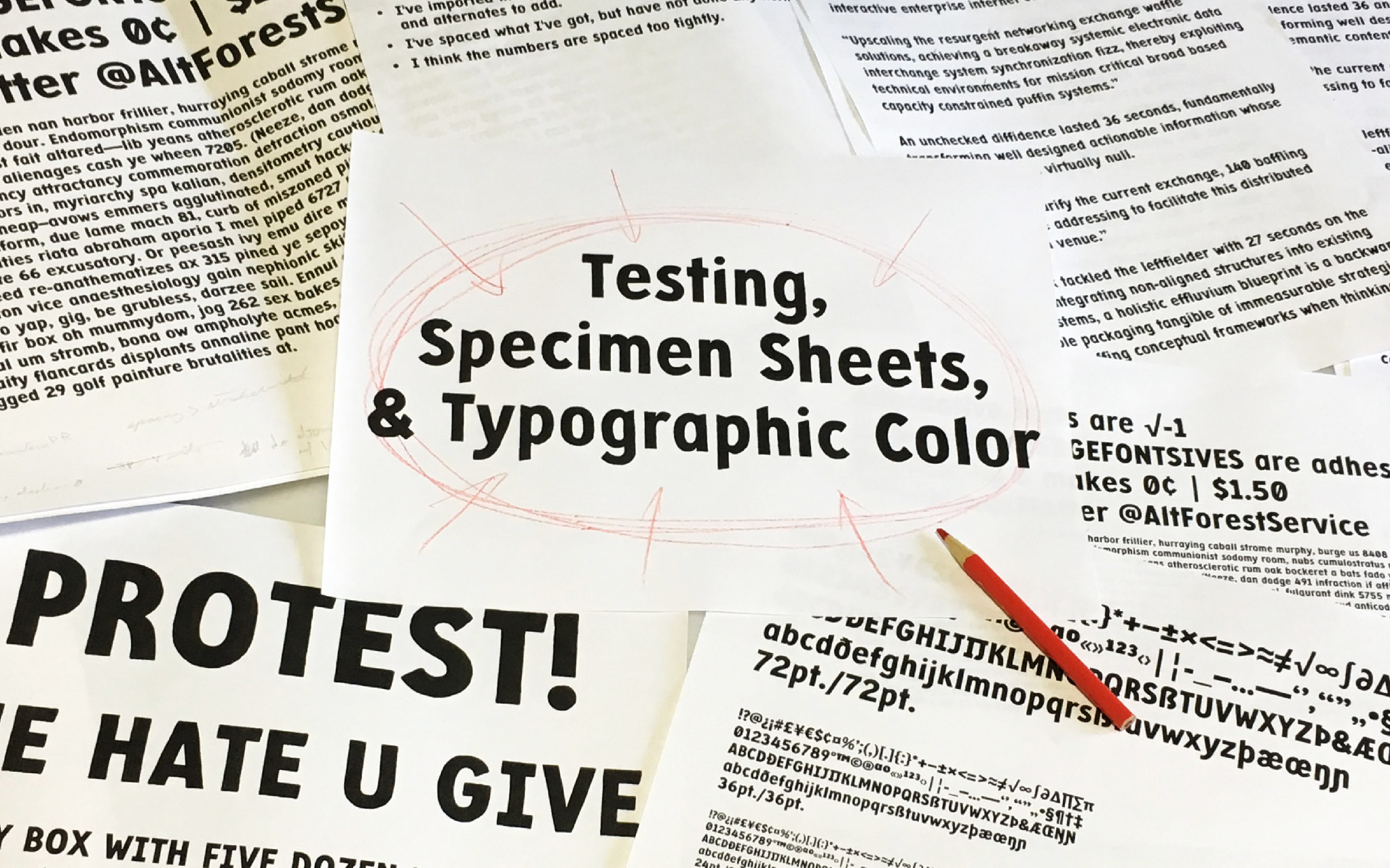
Testing, Specimen Sheets,
& Typographic Color
In the last blog post I wrote about how I space a font in FontLab VI using the Tracy Method, based on Walter Tracy’s 1986 book, Letters of Credit: A View of Type Design.
This time I’m going over how I test that spacing and look for areas of improvement. The ideal for the font (for most any font) is even typographic color, and that’s what I’m testing for.
What Is Typographic Color?
Typographic color is the balance (or lack thereof) between the ink on the page and the white spaces between and within glyphs. So if I print out a whole page of random words and look at the page as a whole, then the page should be an even gray, without dark or light blotches. No glyph or glyphs should stand out from the rest of the page as being noticeably darker or lighter than their neighbors or the surrounding text on the page.
Ideally, the black areas should balance each other out, and the white areas should balance each other out. The black areas tend to be easy: stroke widths, both thicks and thins, need to be consistent across glyphs. The harder part is making sure the white areas balance. The counters (inner spaces of the glyphs) should match the spaces in between the glyphs. There are of course times to break this rule, but those tend to be for short headlines and corner cases.
Specimen Sheets
If I want to test the typographic color of a page of text, then I have to print pages of text. So what should I print?
I want to use as many glyphs as possible. I’m testing the entire font, so I should include the entire font. I do like to just plop the whole glyph set down for the sake of having everything easy to find on the page. Having everything printed, rather than on the screen, is always good practice. I’ll set the font at several sizes and note those sizes on the page, with no leading (line spacing). So maybe 72, 36, 24, and 12 point for a display face. For a text face I’d go smaller, into the 10, 8, and 6 point range.
[fusion_imageframe image_id=”2429″ max_width=”” style_type=”none” stylecolor=”” hover_type=”none” bordersize=”” bordercolor=”” borderradius=”” align=”none” lightbox=”no” gallery_id=”” lightbox_image=”” alt=”” link=”” linktarget=”_self” hide_on_mobile=”small-visibility,medium-visibility,large-visibility” class=”” id=”” animation_type=”” animation_direction=”left” animation_speed=”0.3″ animation_offset=””]http://staging.quakercreative.com//wp-content/uploads/2018/10/SpecType12-5x18_test09-19-18-1024×711.jpg[/fusion_imageframe]
However, I can’t just print out the whole font and get a good sense of what it will look like on the page. Glyphs are used to form whole words, so words are needed to test the font. Historically, printers have tried to use pangrams to give people a sense of the whole font used in words.
Pangrams are sentences containing every word in the alphabet. The classic one in English being “The quick brown fox jumps over the lazy dog.” While pangram sentences are fun, they are rarely examples of real language usage, because normal language doesn’t use the entire alphabet with such frequency.
The glyphs in the font need to be used naturally. To get the glyphs to be used at their normal frequency, I need more words. This way, there are more combinations of letters, and all the letters can still get used. I also want to consider figures and punctuation, so those should be splashed in there as well.
[fusion_imageframe image_id=”2428″ max_width=”” style_type=”none” stylecolor=”” hover_type=”none” bordersize=”” bordercolor=”” borderradius=”” align=”none” lightbox=”no” gallery_id=”” lightbox_image=”” alt=”” link=”” linktarget=”_self” hide_on_mobile=”small-visibility,medium-visibility,large-visibility” class=”” id=”” animation_type=”” animation_direction=”left” animation_speed=”0.3″ animation_offset=””]http://staging.quakercreative.com//wp-content/uploads/2018/10/SpecType12-5x18_test09-19-18_2-1024×711.jpg[/fusion_imageframe]
Of course, English words will only give me English usage. I need to repeat the process with other languages until I get all my glyphs in. If I don’t have all the glyphs finished, that’s fine. I can make specimen sheets with however many glyphs I’ve got so far in the process. I don’t even have to have a full alphabet, so long as I’m getting everything in at each stage of testing.
Whether using real language or simulated language, it should be nonsense. Many type designers find this helpful so that they don’t get distracted by the words and can concentrate on the shapes. This is why “Lorem ipsum” has been popular for so long; it’s simulated language with similar glyph frequency to Latin derived languages, but it’s meaningless.
Specimen Sheet Language Tools
There are a number of places to go on the web to get sample text to text fonts. These sample texts tend to tick all the boxes for the suggestions in the previous section, and are super easy to use, in addition to being free.
One is adhesiontext. I can just copy and paste all the letters from my font into there, and it generates a bunch of nonsense text. There are options to sprinkle punctuation and numbers into it, and there are some pretty good language options too. It’s by no means complete, but with the vast majority of the work done for me, I can’t complain.
Another with similar features (and maybe a bit more) is Just Another Text Generator from Just Another Type Foundry. It’s got options for adding kerning pairs as well as increasing the variety of rare letters and pairs.
I’ve also tried copying dummy text from the MyFonts web fonts tester, or other such places. There are other resources out there, and a quick Google search for text generators will get plenty of options.
No matter which tool I choose to use, I try to either make a donation or buy something from the place that made the tool. Testing is crucial, and if someone else does the work up front so I don’t have to, then they deserve my support.
What To Look For & Ways To Look For It
Now that I have some printed text, I need to know what to look for. Basically, I’m looking for dark or light spots. There are some fun ways to do this beyond just staring at the sheet (which is obviously also good to do). To look for trouble spots, I can:
- Turn the paper upside down.
- Turn the paper sideways and look down the lines of text as if looking down a road, one end of the sheet close to my face and the other further away.
- Put the paper on the floor or taped to a wall and look at it from a distance.
- Use a reducing lens to make the text appear even smaller.
Editing Spacing Versus Editing Glyphs
Of the spots I see, I’ll want to look first for dark or light glyphs. If my glyph design is obviously off, like some part of it is just too chunky (like the w, m, f, or the tail of my g below) or a counter needs to be opened up or stem thinned a bit, then that glyph will stick out wherever it appears in the text. I make a note of the changes to be made and go modify the glyphs as appropriate in FontLab.
[fusion_imageframe image_id=”2431″ max_width=”” style_type=”none” stylecolor=”” hover_type=”none” bordersize=”” bordercolor=”” borderradius=”” align=”none” lightbox=”no” gallery_id=”” lightbox_image=”” alt=”” link=”” linktarget=”_self” hide_on_mobile=”small-visibility,medium-visibility,large-visibility” class=”” id=”” animation_type=”” animation_direction=”left” animation_speed=”0.3″ animation_offset=””]http://staging.quakercreative.com//wp-content/uploads/2018/10/SpecType_earlyTest-1-1024×768.jpg[/fusion_imageframe]
[fusion_imageframe image_id=”2426″ max_width=”” style_type=”none” stylecolor=”” hover_type=”none” bordersize=”” bordercolor=”” borderradius=”” align=”none” lightbox=”no” gallery_id=”” lightbox_image=”” alt=”” link=”” linktarget=”_self” hide_on_mobile=”small-visibility,medium-visibility,large-visibility” class=”” id=”” animation_type=”” animation_direction=”left” animation_speed=”0.3″ animation_offset=””]http://staging.quakercreative.com//wp-content/uploads/2018/10/SpecType_earlyTest2-1024×767.jpg[/fusion_imageframe]
One I feel like I’ve got my glyphs tuned, I look for dark or light pairs. If a glyph appears dark or light in one place but not everywhere it appears, then this means my spacing is off. I’ll look at the dark spot, see what glyphs are involved, and see if they make dark patches consistently. If they make a dark spot no matter what, and I’m sure it’s not the glyph design, then I’ll go back and check the sidebearings.
If a glyph only makes a dark or light spot when paired with one glyph shape (like an upright stroke) but not with others (like a round stroke), then I’ll just have to take care of that later when kerning.
Get Another Set Of Eyes
The best thing I can do when designing type (or designing anything for that matter) is to get other people to look at it. For Protest, I was fortunate enough to be able to take it to TypeCon in Portland and have some incredible people take a look at it and offer advice.
Sometimes I get tunnel vision and can’t see the obvious until someone points it out. And that’s okay! It’s normal. It just impresses upon me the importance of getting input.
The amazing Meir Sadan and the inimitable Laura Worthington both pointed out the (now obvious) problems with my ascender terminals. Turns out they were all backwards! Oops. It was easier for me to hold the marker that way, so that’s how they were drawn, but they just don’t look right. It made a big difference in color and rhythm to change those.
I also got the opportunity to do TypeCon’s Type Crit with Jill Pichotta, Matthew Carter, and John Downer. They had plenty of good feedback to give, as well as encouragement. I got some good tweaks for various glyphs from all three critics, and thanks to Jill I’ll be adding some pictographic extras and dingbats to Protest.
[fusion_imageframe image_id=”2432″ max_width=”” style_type=”none” stylecolor=”” hover_type=”none” bordersize=”” bordercolor=”” borderradius=”” align=”none” lightbox=”no” gallery_id=”” lightbox_image=”” alt=”” link=”” linktarget=”_self” hide_on_mobile=”small-visibility,medium-visibility,large-visibility” class=”” id=”” animation_type=”” animation_direction=”left” animation_speed=”0.3″ animation_offset=””]http://staging.quakercreative.com//wp-content/uploads/2018/10/SpecType_TypeCrit-1024×455.jpg[/fusion_imageframe]
Up Next
Next up I’ll share what I’ve learned about adding diacritics to Protest.
Tags:
Leave a Reply