
Your cart is currently empty!
How do I visualize an idea with letters?
Part 5: Joy
This is part five of a five part series detailing how I interpret certain values using various letterforms. In Part 1 I shared the process I use to visualize a certain idea through letterforms. Today I am going through example number 4, Joy.
Note that the order in which I’m writing this is not necessarily the order in which I work. This is essentially a breakdown of part of the Conceptual Phase of my lettering process. Ideas come in stream of consciousness, and that’s the most efficient way to explore them—as they come. But breaking down the process after the fact can help to hone and refine how I work, making it easier in the future.
If you haven’t read Part 1, I encourage you to do so. What follows is just a rundown of that process as applied to this specific example, in order to highlight how each portion of the process can potentially benefit a given project.
What do I associate with Joy?
The easiest place to start conceptualizing is with free association, as I noted in Parts 1–4. I typically start with a mind map. For more details on mind mapping, see Part 2.
The whole point of mind mapping and free association is to get ideas out, and to try to get concrete visuals out of them. The ideation proecss is a delicate balance between following an idea and keeping options open. Ultimately, I have to settle on an idea. So if an idea really grabs my attention, then I won’t fight too hard to have other ideas for the sake of variety. Again, it’s a balance.
The examples in this blog series were part of my Positive Words Alphabet lettering series. As of this writing I am currently posting a lettering project per day to Instagram as a way to boost my practice and prductivity.
I have to admit that for this practice I cut corners where I can for the sake of time. Joy was one place I cut corners by not doing a mind map. I did a logo design relatively recently with joy as a central theme, so I already had plenty ideas about visualizing Joy. So if the whole point of mind mapping is to come up with ideas, then I already had that covered.
That being said, I associate smiling, light, outward focused energy, movement and roundness with the concept of Joy.
What are some historical
associations with Joy?
As with Kindness, historical associations come up empty for me when it comes to Joy. I could dig something up with research. Ultimately, though, if something doesn’t come to mind with some thought and without a search, then chances are the immediate associations won’t be there for other people.
This is why I don’t rely on any single one of these methods to come up with ways to visualize an idea. Where one method doesn’t bear fruit, others do.
What kind of body language communicates Joy?
Just as humanity has a common vocabulary of body language, letter forms have a body language of their own. So what kind of body language communicates Joy?
I already have smiling in my list, and energy & movement lend themselves well to bodily expression. Energy is often expressed by open features, limbs and extremities extended. How do I apply these human attributes to letterforms?
[fusion_imageframe image_id=”1749″ style_type=”none” stylecolor=”” hover_type=”none” bordersize=”” bordercolor=”” borderradius=”” align=”none” lightbox=”no” gallery_id=”” lightbox_image=”” alt=”” link=”” linktarget=”_self” hide_on_mobile=”small-visibility,medium-visibility,large-visibility” class=”” id=”” animation_type=”” animation_direction=”left” animation_speed=”0.3″ animation_offset=””]https://www.societyoffonts.com/wp-content/uploads/2017/04/Notebook-Joy1-1024×747.jpg[/fusion_imageframe]
I found that it’s very difficult to make a J look as if it’s smiling. For some reason Js always make me think of a serious or even slack-jawed face. I toyed with the idea of a smiling J, and came up with a reasonable solution. But it wasn’t quite doing it for me.
Energy and movement, while bodily qualities, are not universally human, and can just as easily be expressed in other ways. Which brings me to…
How would I write while feeling or embodying Joy?
Feeling Joy is something I can do! It’s far easier to imagine experienceing an emotion like joy than it is to embody community or integrity or kindness.
Expressing motion and energy comes more naturally when writing. Putting energy into writing is natural. People can see the energy put into the creation of letterforms when looking at a written sample. And motion comes with the territory. The more motion in the strokes, the more motion is expressed in the letters.
This is where choosing a writing tool becomes more of a factor. A pencil or ballpoint or other monoline writing tool can’t express as much of a range of motion as a tool that can change weight. All writing tools demonstrate two dimensions of movement: width and height. A brush or a flexible nib pen can express a thrid dimension: depth. When the writer pushes down on the tool (depth) the stroke becomes wider.
Now, change in width can be acheived through the angle of a parallel or broad nib pen. But the tool is usually apparent in the form, and the viewer knows (unconsciously or not) that the pen hasn’t changed depth in the writing. Change in pressure (depth) is also apparent with a flexible nib pen, but it’s movement and range is still limited by the rigid material of the nib.
Here the brush pen has the most expressive range. It can express in three dimensions, as well as flex and spread out. This echos the idea of open body language. Brushes also lend themselves well to round forms.
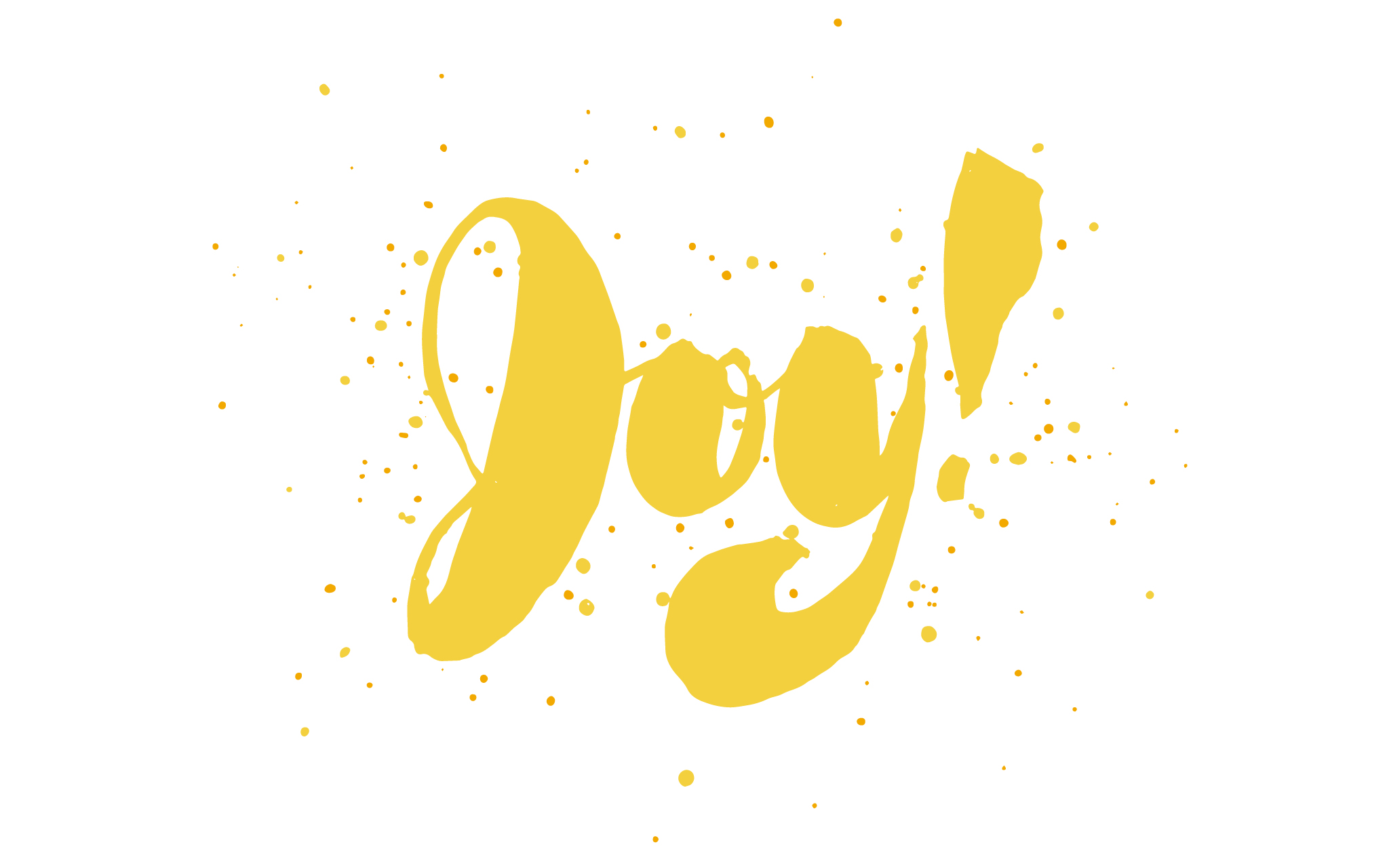
I experiment with a brush pen with a few different forms. Incidentally, a script J looks more smiley to me than a roman J.
[fusion_imageframe image_id=”1745″ style_type=”none” stylecolor=”” hover_type=”none” bordersize=”” bordercolor=”” borderradius=”” align=”none” lightbox=”no” gallery_id=”” lightbox_image=”” alt=”” link=”” linktarget=”_self” hide_on_mobile=”small-visibility,medium-visibility,large-visibility” class=”” id=”” animation_type=”” animation_direction=”left” animation_speed=”0.3″ animation_offset=””]https://www.societyoffonts.com/wp-content/uploads/2017/04/Notebook-Joy-1024×768.jpg[/fusion_imageframe]
So now I get to have fun. I just write with all the expressiveness I can muster. In the end I end up joyfully splattering some ink from the brush pen onto my lettering. The spatters demonstrate the idea of outward focused energy, as if the letterforms are literally bursting with joy.
Which results demonstrated Joy best?
In this instance writing with feeling produced some great results. The expressiveness that comes with writing is really hard to match with drawing. The body language tack was helpful as well.
This is one of those cases that could go so many ways. I could easily see free association turning out some really good results with greater constraints and additional context provided by a creative brief.
[fusion_imageframe image_id=”1748″ style_type=”none” stylecolor=”” hover_type=”none” bordersize=”” bordercolor=”” borderradius=”” align=”none” lightbox=”no” gallery_id=”” lightbox_image=”” alt=”” link=”” linktarget=”_self” hide_on_mobile=”small-visibility,medium-visibility,large-visibility” class=”” id=”” animation_type=”” animation_direction=”left” animation_speed=”0.3″ animation_offset=””]https://www.societyoffonts.com/wp-content/uploads/2017/04/Joy-photo-1024×768.jpg[/fusion_imageframe]
* * *
I hope this series has demonstrated some helpful ways to approach visualizing abstract ideas through letterforms.
If you haven’t read the rest of the series, I highly recommend at least checking out Part 1, the overview of the whole process.
Leave a Reply