
Your cart is currently empty!
Defining the Terms
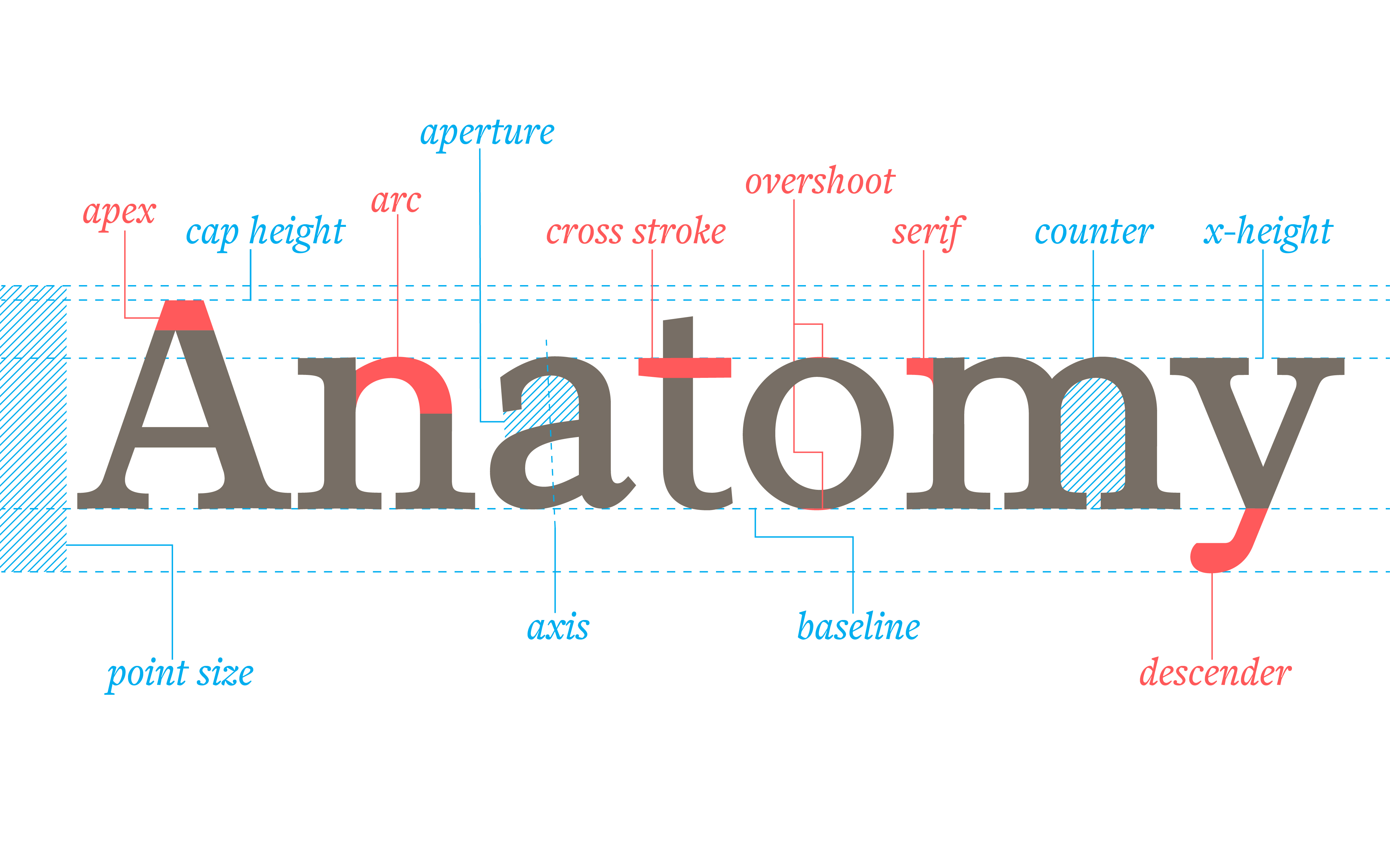
Part 1: Anatomy
This is a three part series on how to talk about letterforms. Basically, it’s a glossary. This first part deals with the Anatomy of Letterforms, what the pieces and parts are called. Part 2 covers Process, the terms for the ways letters are made, whether by hand or by computer. Part 3 is Categorization, the ways groups of glyphs are labeled by form and function.
This is by no means exhaustive, but it’s a good working terminology for anyone creating with letters.
(It is my intent to add to this gloassary over time, so that eventually it may be more comprehensive.)
A B C D E F G H I J K L M N O P Q R S T U V W X Y Z
A
Abrupt serif—a serif with no bracket.
Accent—see Diacritic
Adnate serif—a bracketed serif.

Aperture—the opening of a not entirely closed, somewhat rounded space within a character (such as in ‘c’).
Apex—the topmost intersection where two strokes terminate.

Arc—a curved portion of a stroke.

Arm—a horizontal or upward stroke that does not connect with a stem on at least one end.
Ascender—portion of the lowercase that rises above the x-height.
Axis—the imaginary line bisecting the upper- and lowermost points where a stroke becomes thinnest.

B
Baseline—the line on which the letters of a font seem to rest.
Beak—a serif-like terminal in some serif type designs.

Bowl—the curved part of a letter surrounding a counter.
Bracket—a curved or wedge-like connection between a serif and the main stroke.

C
Cap height—the distance from the baseline to the top of the uppercase letters.
Character—a symbol with a unique linguistic meaning, such as a letter, number, punctuation mark, etc.
Counter—the typically rounded negative space partially or fully enclosed by part of a letter.
Crossbar—a horizontal stroke bridging two other strokes.
Cross stroke—a typically horizontal stroke crossing the stem of the lowercase ‘t’ or ‘f’.
Crotch—the inner angle where two strokes connect.

D
Descender—portion of the lowercase which extends below the baseline.

Diacritic—an ancillary mark or sign added to a letter. Accents are a type of diacritic used with the Latin alphabet to denote a specific pronunciation. Other writing systems may use diacritics to indicate sounds beyond the basic alphabet.
Digraph—two characters that make a single sound.
Double story—a version of ‘a’ or ‘g’ with two counters, as opposed to a single story.

E
Ear—that funny bit on the top right of a double story ‘g’.

Eye—the counter of the lowercase ‘e’.
F
Finial—the tapered terminal of a curved stroke.
Flag—the topmost horizontal stroke of the number ‘5’.

Foot—the end of a stem or stroke resting on the baseline.
G
Gadzook—a decorative detail connecting the letters in a ligature but is not a stroke essential to either letter.

Glyph—a unique drawing of a character or characters as a single unit. (For instance, a single character may have more than one glyph, like the y’s above. Or there may be multiple characters in a single glyph, as in a ligature.)
I
Ink trap—additional space added where two strokes form an acute angle, done to avoid ink build-up in that spot when the character is printed. It’s a space designed to literally trap excess ink.
J
Joint—the place where a stroke joins a stem.

L
Leg—the short, often diagonal, downstroke of letters like ‘R’, ‘K’ and ‘k’, typically resting on the baseline.

Ligature—two or more characters joined to make a single glyph. (The ‘fl’ ligature above is common. The ampersand is a ligature of ‘et’, meaning “and” in Latin.)
Link—the stroke joining the top and bottom bowls of a double story lowercase ‘g’.

Lobe—a curved or rounded projection from the stem or main portion of the letter.
Loop—the bowl below the baseline on a double story lowercase ‘g’.
Lowercase—the smaller form of the bicameral Latin alphabet based on the Carolingian minuscule.
N
Neck—also known as a collar or link, the stroke that connects the top and bottom portions of a lowercase ‘g’.
O
Overshoot—portion of a letter pushing just beyond a line of measurement to achieve the appearance of being the same height as comparable letters.

P
Petit caps—uppercase letters sized the same as the x-height of the lowercase. Used in conjunction with lowercase they can form a unicase font: a font with all letterforms the same height.
Point size—distance from the descender line to the ascender line or top of the tallest diacritic. (This is mostly true of metal or wood type. Digital type size is arbitrary, at the whim of the designer. It is based purely on what percentage of the height of the imaginary digital box a designer wishes to make the glyphs. One font’s 12pt may be larger than another font’s 12pt.)
S
Sans serif—without serifs.
Serif—a small stroke added to the end of a main stroke.

Shoulder—the curve at the beginning of a downward stroke, such as in ‘m’, ‘n’, or ‘h’.
Single story—a version of ‘a’ or ‘g’ with one counter, as opposed to a double story.
Slab serif—a serif with little to no contrast in width to the main stroke.
Small Caps—uppercase letters set at about the same height and weight as lowercase letters.

Spine—the primary curved stroke of the letter ‘S’ or ‘s’.
Spur—a small protrusion off a main stroke.
Stem—the main, typically vertical, stroke of a glyph.
Stroke—a line forming part of a written or printed character.
Swash—an addition at the end of a stroke intended to beautify or add other visual interest to a glyph beyond what is necessary to define a character.
T
Tail—the descending, often decorative, stroke of the ‘Q’, and sometimes ‘R’ or ‘K’.

Terminal—the end of a stroke.
- Abrupt—the stroke ends without taper or embellishment.
- Ball—the stroke finishes with a circular shape.
- Calligraphic—the stroke finish gives a strong indication of the shape of the writing instrument used to form the letter.
- Foxtail—the end of the stoke widens before curving around and ending in a point, similar to the shape of a fox’s tail.
- Lachrymal or Teardrop—the stroke finishes in a teardrop shape.
- Wedge—the stroke has a serif-like wedge added to it.

Three-quarter caps—uppercase sized about halfway between the x-height and cap height, typically used for acronyms.
Tittle—the dot on the ‘i’ or ‘j’.
U
Uppercase—the larger form of the Latin bicameral alphabet based on Roman capitals.
V
Vertex—the bottommost intersection where two strokes terminate.
X
X-height—the height of the lowercase without ascenders or descenders, usually typified by the height of the letter ‘x’.
Leave a Reply