
Your cart is currently empty!
Defining the Terms
Part 2: Process
This is a three part series on how to talk about letterforms. Basically, it’s a glossary. This second part covers Process, the terms for the ways letters are made. Part 1 deals with the Anatomy of Letterforms, what the pieces and parts are called. Part 3 is Categorization, the ways groups of glyphs are labeled by form and function.
This is by no means exhaustive, but it’s a good working terminology for anyone creating with letters.
(It is my intent to add to this glossary over time, so that eventually it may be more comprehensive.)
The first part was alphabetized because there were so many terms. I’d like to eventually break up a comprehensive type glossary into more of a topical format, rather than simply alphabetical. This series is my first attempt at that. This part in partiular is not alphabetized, but simply broken into topically related elements, which are small enough not to need alphabetizing to find anything quickly. This is all an experiment, so thanks for bearing with me.
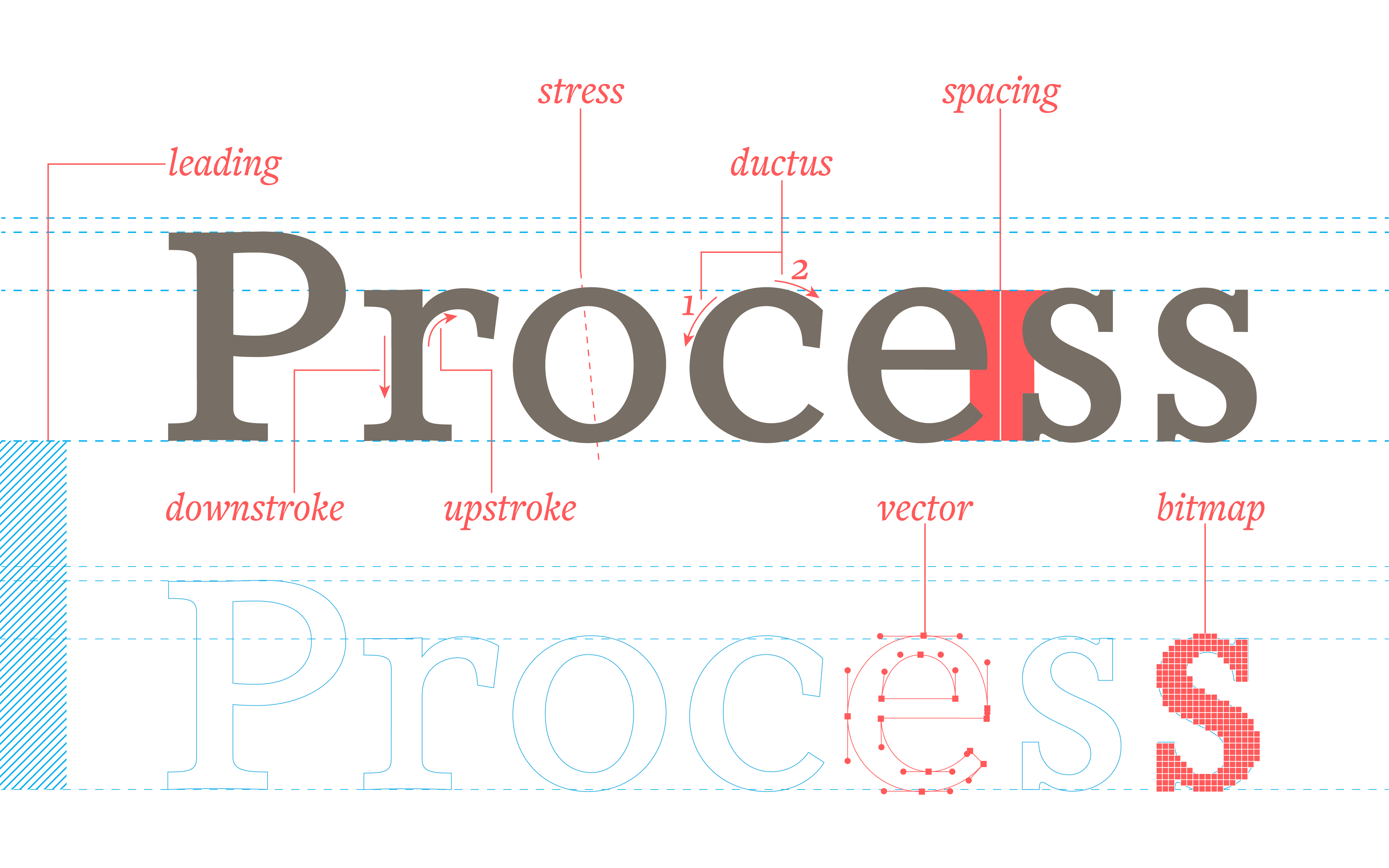
Making Glyphs
[fusion_imageframe image_id=”1831″ style_type=”none” stylecolor=”” hover_type=”none” bordersize=”” bordercolor=”” borderradius=”” align=”none” lightbox=”no” gallery_id=”” lightbox_image=”” alt=”” link=”” linktarget=”_self” hide_on_mobile=”small-visibility,medium-visibility,large-visibility” class=”” id=”” animation_type=”” animation_direction=”left” animation_speed=”0.3″ animation_offset=””]https://www.societyoffonts.com/wp-content/uploads/2017/04/TypeGlossary_ductus-1024×1024.jpg[/fusion_imageframe]
Ductus—the number and sequence of strokes to make a character.
Stress—the angle of the writing instrument, a.k.a. the axis.
Downstroke—the stoke created with an overall downward movement, typically the thicker stroke.
Upstroke—the stoke created with an overall upward movement, typically the thinner stroke.
Hairline—another (less apt) term for the upstroke.
Contrast—the difference in width between the up- and downstroke.
Spacing Glyphs
[fusion_imageframe image_id=”1833″ style_type=”none” stylecolor=”” hover_type=”none” bordersize=”” bordercolor=”” borderradius=”” align=”none” lightbox=”no” gallery_id=”” lightbox_image=”” alt=”” link=”” linktarget=”_self” hide_on_mobile=”small-visibility,medium-visibility,large-visibility” class=”” id=”” animation_type=”” animation_direction=”left” animation_speed=”0.3″ animation_offset=””]https://www.societyoffonts.com/wp-content/uploads/2017/04/TypeGlossary_spacing-1024×1024.jpg[/fusion_imageframe]
Spacing—the horizontal space between glyphs determined by the side bearings of each glyph.
Side bearings—the left and right edges of the invisible bounding box containing a glyph. (In metal type this would be the sides of the metal slug containing the glyph.)
Tracking—a consistent change in the amount of space between multiple consecutive glyphs. Also called letter spacing.
Kerning—a change in spacing between two glyphs. Kerning is typically set in the font design to solve spacing problems between specific letter pairs. The better the spacing in a font, the fewer kerning pairs are necessary.
Leading—the amount of vertical space between lines of type, measured from baseline to baseline. (Originally the vertical space between the bottom of a line of metal type and the top of the next, determined by inserting strips of lead or copper.)
Rendering Glyphs
[fusion_imageframe image_id=”1832″ style_type=”none” stylecolor=”” hover_type=”none” bordersize=”” bordercolor=”” borderradius=”” align=”none” lightbox=”no” gallery_id=”” lightbox_image=”” alt=”” link=”” linktarget=”_self” hide_on_mobile=”small-visibility,medium-visibility,large-visibility” class=”” id=”” animation_type=”” animation_direction=”left” animation_speed=”0.3″ animation_offset=””]https://www.societyoffonts.com/wp-content/uploads/2017/04/TypeGlossary_raster-1024×1024.jpg[/fusion_imageframe]
Vector—a mathematical equation that defines a line, used to describe the outlines of a glyph.
Rasterize—to convert vector outlines into a set of pixels.
Hinting—information added to a font to help it display better at smaller sizes when rasterized.
Bitmap—a set of pixels defining a shape.
Leave a Reply