
Your cart is currently empty!
Mathematic Symbols
Part 4: Greek
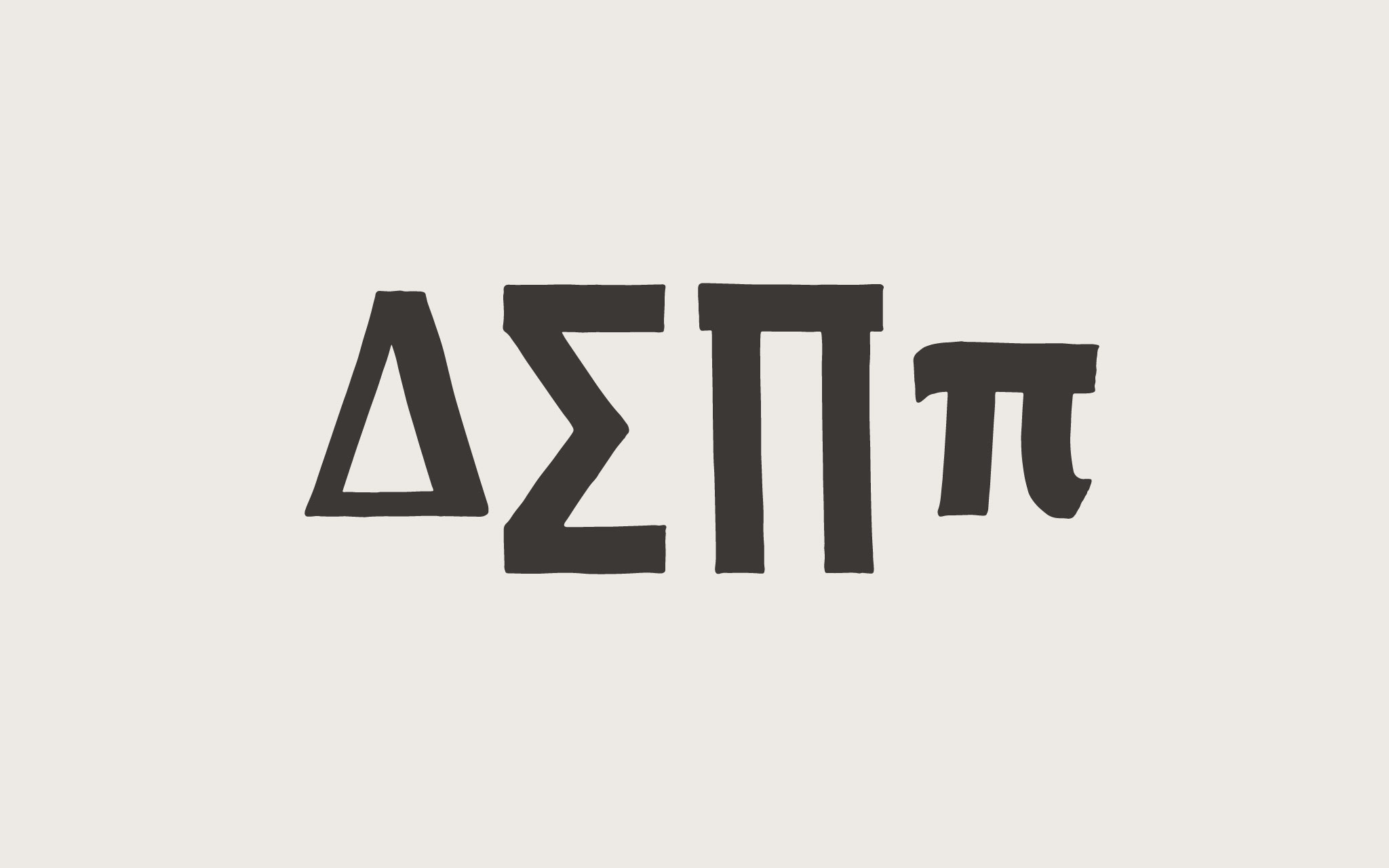
Part 3 of this series was about the radical, integral, partial derivative, and infinity signs (√ ∫ ∂ ∞). This final math symbols post, Part 4, covers four Greek derived math symbols: Δ ∑ ∏ π (delta, sum, product, and pi).
The only constant is Change
The uppercase Greek delta symbol (Δ) is used in mathematics to denote a change or difference. Delta, being an uppercase letter, sits on the baseline and rises to cap height. The width at the base of the delta is about the same at the width of the uppercase M.
[fusion_imageframe image_id=”2250″ style_type=”none” stylecolor=”” hover_type=”none” bordersize=”” bordercolor=”” borderradius=”” align=”none” lightbox=”no” gallery_id=”” lightbox_image=”” alt=”” link=”” linktarget=”_self” hide_on_mobile=”small-visibility,medium-visibility,large-visibility” class=”” id=”” animation_type=”” animation_direction=”left” animation_speed=”0.3″ animation_offset=””]http://staging.quakercreative.com//wp-content/uploads/2018/02/MathSymbols-delta-02-1024×640.jpg[/fusion_imageframe]
Like the cap A, the right diagonal stroke is the downstroke, and the others are the thinner strokes. Protest is a low contrast typeface, but the math symbols, I feel, call out for some contrast to set them apart.
The apex of the delta can come to a point above the cap line or flatten out at the cap line. To match the A and conform better to the limitations of my tool, I’ve chosen to have a flat apex at cap height.
Sum it all up
The mathematical symbol for sum ( ∑ ) is derived from the Greek uppercase sigma ( Σ ). The sum symbol is much taller, as it needs to envelop or overshadow the glyphs that follow it, similar to the integral symbol.
It sits just a tad bit above the cap height in order to situate its top stroke above any figures or letters with ascenders. It dips below the baseline for the same reason, but doesn’t need to go lower than the descender line. In many instances the sum sign will not go as low as the descender, which is what I’ve opted to do for Protest.
[fusion_imageframe image_id=”2254″ style_type=”none” stylecolor=”” hover_type=”none” bordersize=”” bordercolor=”” borderradius=”” align=”none” lightbox=”no” gallery_id=”” lightbox_image=”” alt=”” link=”” linktarget=”_self” hide_on_mobile=”small-visibility,medium-visibility,large-visibility” class=”” id=”” animation_type=”” animation_direction=”left” animation_speed=”0.3″ animation_offset=””]http://staging.quakercreative.com//wp-content/uploads/2018/02/MathSymbols-sum-02-1024×640.jpg[/fusion_imageframe]
In terms of width, it is not as wide as the uppercase M, like delta, but it is wider than the uppercase E. It’s just a matter of finding a visual balance.
The diagonal portions join at mid-height. The joint doesn’t exted all the way to the right, much like the tie (middle arm) on the uppercase E doesn’t usually extend as far as the upper or lower arms.
Product launch
The product sign ( ∏ ), like the sum symbol, is derived from a greek uppercase letter. Prodct is a larger version of uppercase pi ( Π ). It is as tall as sum, but as wide as an uppercase M.
[fusion_imageframe image_id=”2252″ style_type=”none” stylecolor=”” hover_type=”none” bordersize=”” bordercolor=”” borderradius=”” align=”none” lightbox=”no” gallery_id=”” lightbox_image=”” alt=”” link=”” linktarget=”_self” hide_on_mobile=”small-visibility,medium-visibility,large-visibility” class=”” id=”” animation_type=”” animation_direction=”left” animation_speed=”0.3″ animation_offset=””]http://staging.quakercreative.com//wp-content/uploads/2018/02/MathSymbols-product-02-1024×640.jpg[/fusion_imageframe]
While a sans uppercase Pi doesn’t typically have slablike serifs on the top, some typefaces include them in the product sign. I imagine this is to help differentiate it from its Greek counterpart, and that seems like a good reason to me. So I’ve included some overshoot on the horizontal stroke for Protest.
Pi in the (type)face
The mathematical figure pi (π) is the Greek lowercase pi, with no changes. It’s a fun little symbol, with a variety of stylistic variants throughout its incarnations in myriad sans serif typefaces. I’ve looked at a bunch, written them a bunch, and chosen the one I like best.
[fusion_imageframe image_id=”2251″ style_type=”none” stylecolor=”” hover_type=”none” bordersize=”” bordercolor=”” borderradius=”” align=”none” lightbox=”no” gallery_id=”” lightbox_image=”” alt=”” link=”” linktarget=”_self” hide_on_mobile=”small-visibility,medium-visibility,large-visibility” class=”” id=”” animation_type=”” animation_direction=”left” animation_speed=”0.3″ animation_offset=””]http://staging.quakercreative.com//wp-content/uploads/2018/02/MathSymbols-pi-02-1024×640.jpg[/fusion_imageframe]
It doesn’t have too much contrast. I’ve chosen for it to harmonize with the lowercase. It has a tad bit more counter area than the n, so that was my gauge.
Up Next
I’m finally tackling diacritics! I have a strong desire to do this right, so I’m going to study up and draw a lot. I know I’ll probably make some janky marks, but that’s what the testing and review process is for later on.
Leave a Reply