Your cart is currently empty!
-
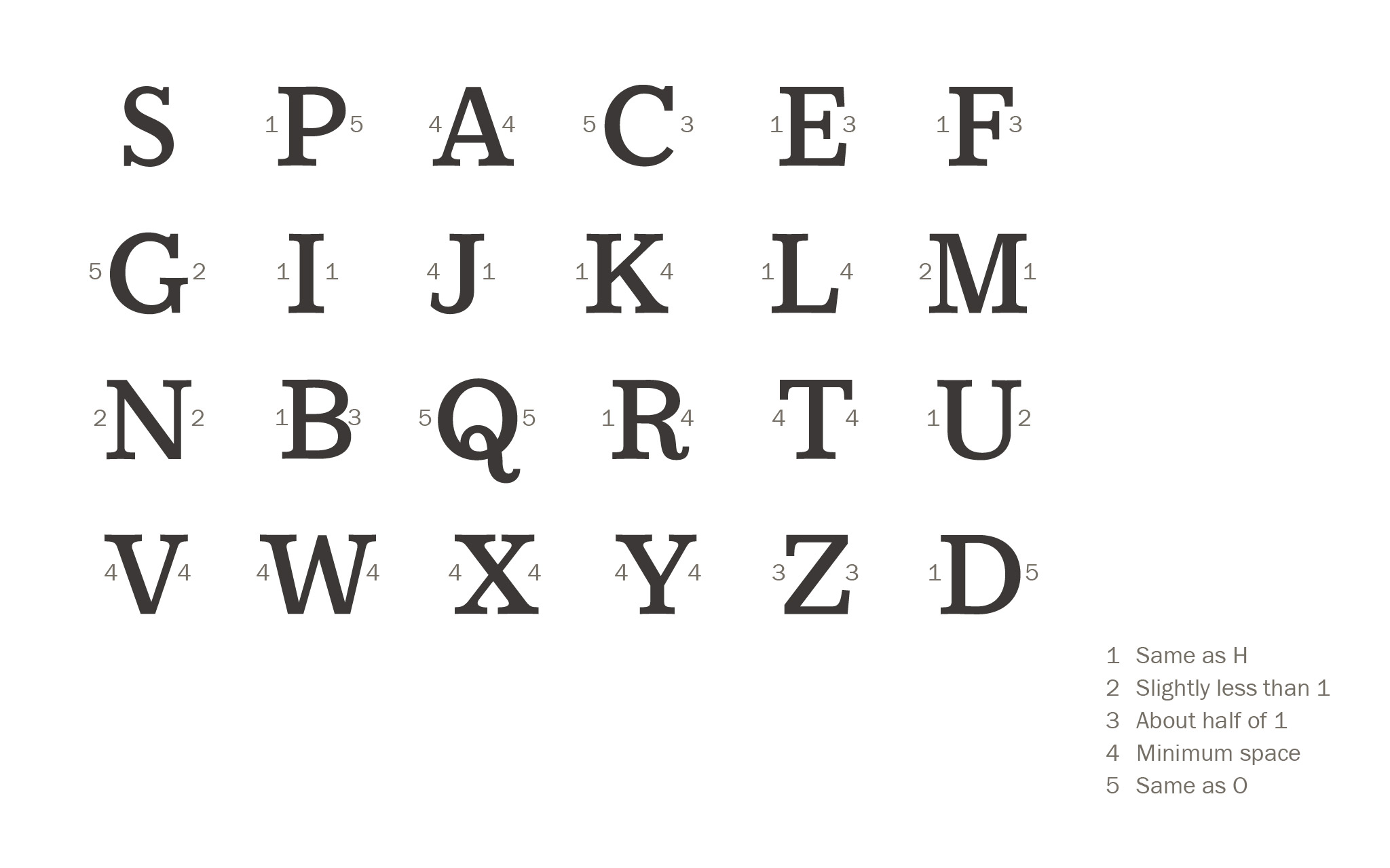
Last time on the blog I wrote about what it means to space a font. I also made an introduction to the Tracy Method, based on Walter Tracy’s 1986 book, Letters of Credit: A View… (Continue reading…)
-
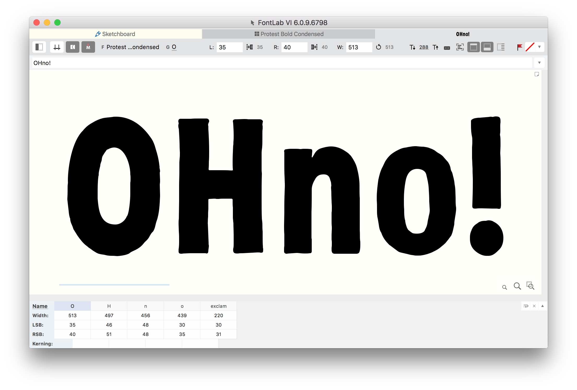
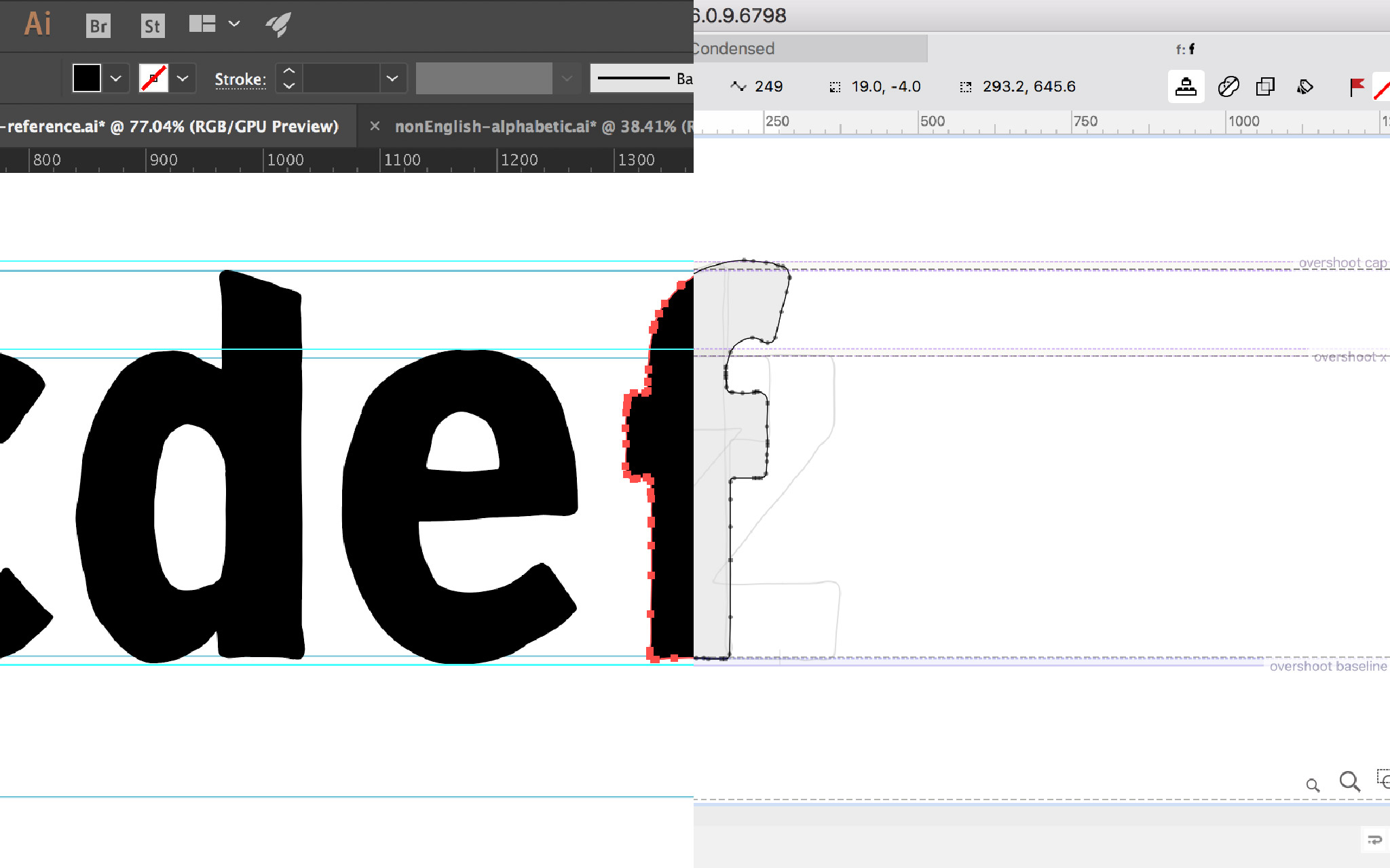
Last time on the blog I went through the whole process of taking digitized glyphs from Adobe Illustrator to FontLab VI. It was kinda long, because FontLab is powerful, but has some quirks. In this… (Continue reading…)
-
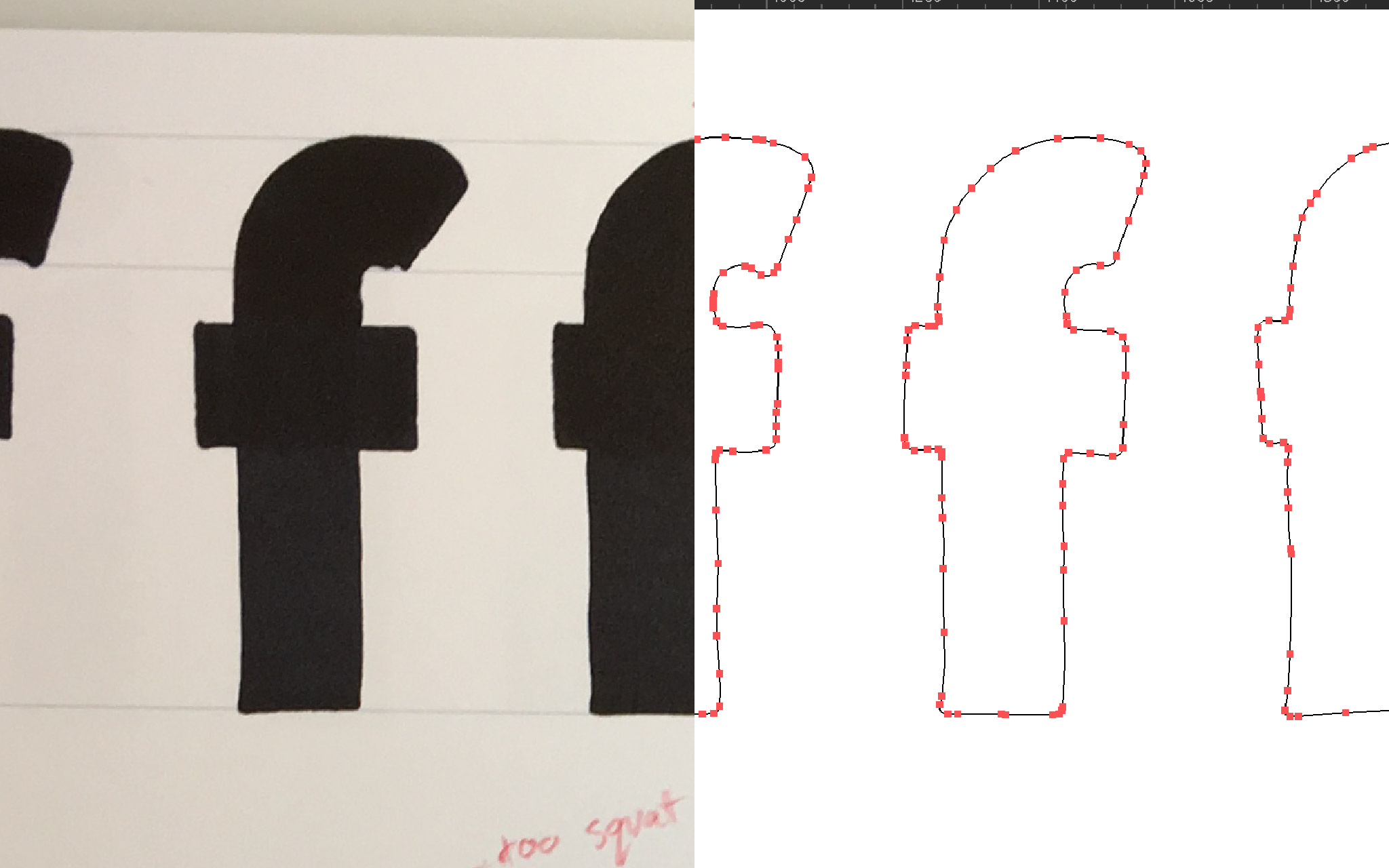
In my previous post I walked through my process of digitizing hand drawn glyphs. For a typeface that’s supposed to look hand drawn like Protest, digitizing using Adobe Illustrator’s Image Trace seemed to yield the… (Continue reading…)
-
Now that I’m finished drawing all the glyphs for my Protest font (for more on that, see my last 38 blog posts), it’s time to digitize! I’d be lying if I said I drew everything… (Continue reading…)
-
The previous post in this series deals with round and symmetrical forms including the dot, umlaut, ring, breve, and macron ( ˙ ¨ ˚ ˘ ¯ ). Here in Part 3 I’ll cover marks that… (Continue reading…)
-
Part 1 of this Diacritics series covers the acute, double acute, grave, circumflex, and caron ( ´ ˝ ` ˆ ˇ ). These marks are the ones that are built with diagonal strokes and asymmetric… (Continue reading…)


